Part 3 – Outdoors
Project 1 – Trees
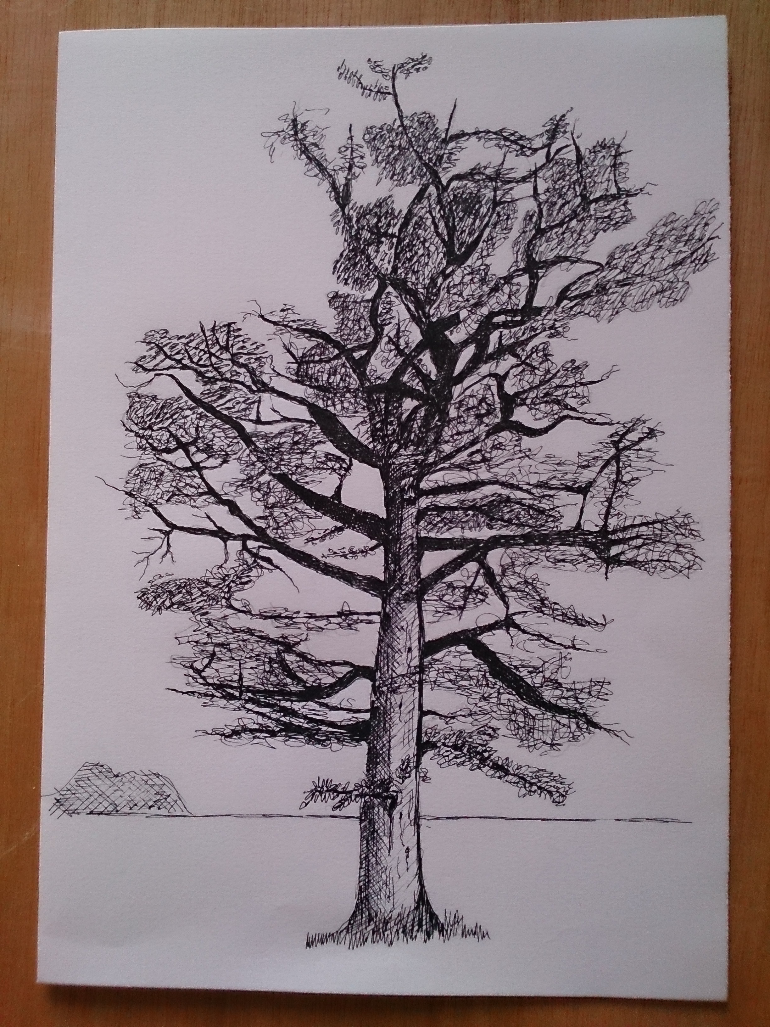
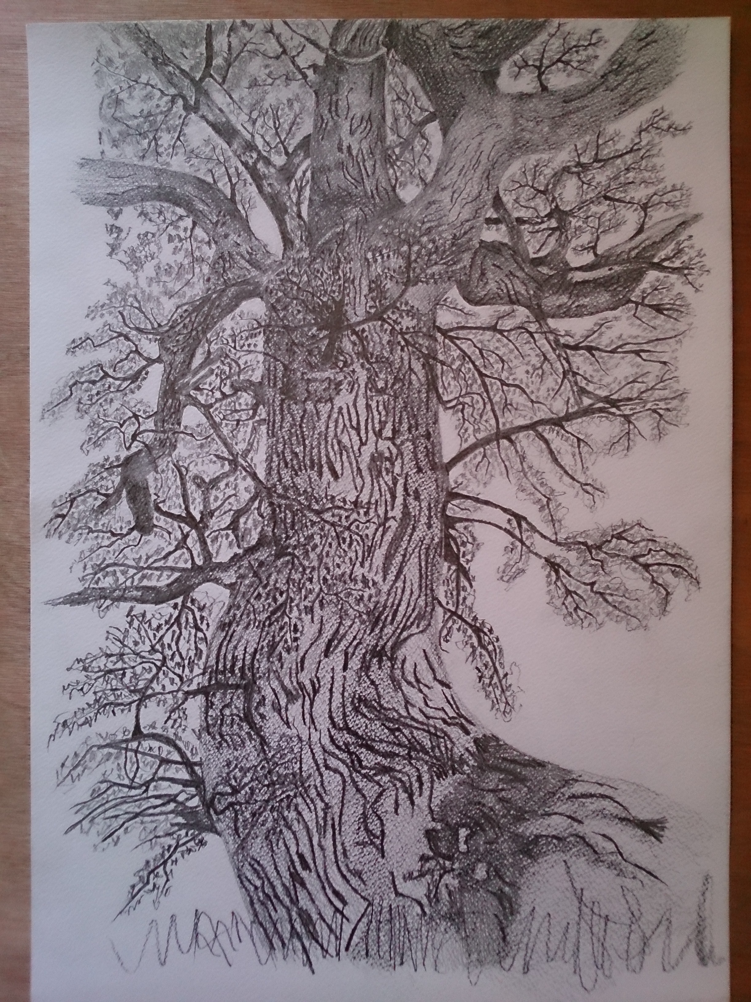
Exercise 1 – Sketching Individual Trees
Page 87
Rough sketches of individual trees in my local park across the road. (Cai Ddol – Ruthin)
1)
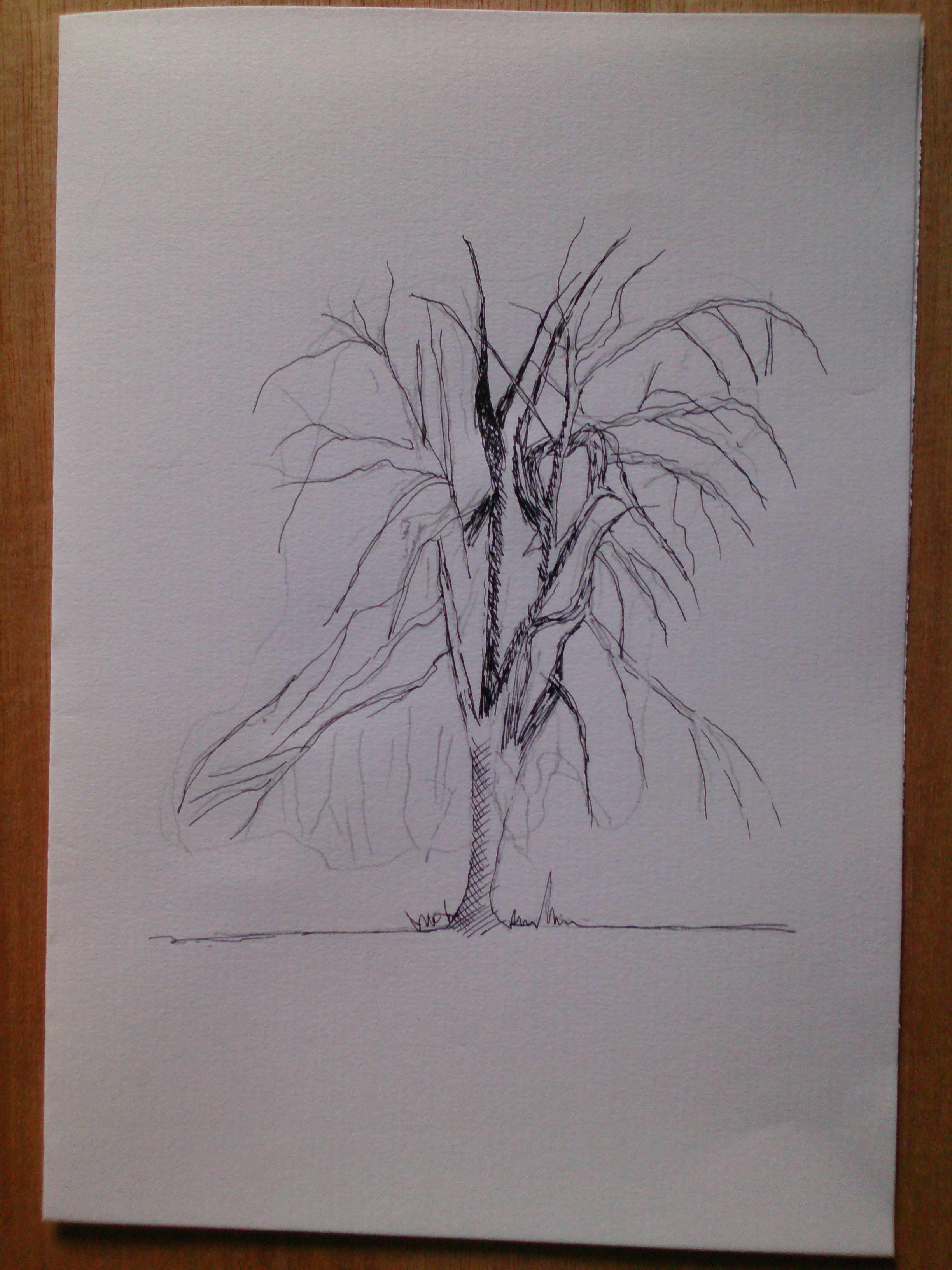
2)
Exercise 2 – Larger Observational Study of an Individual Tree.
Page 88
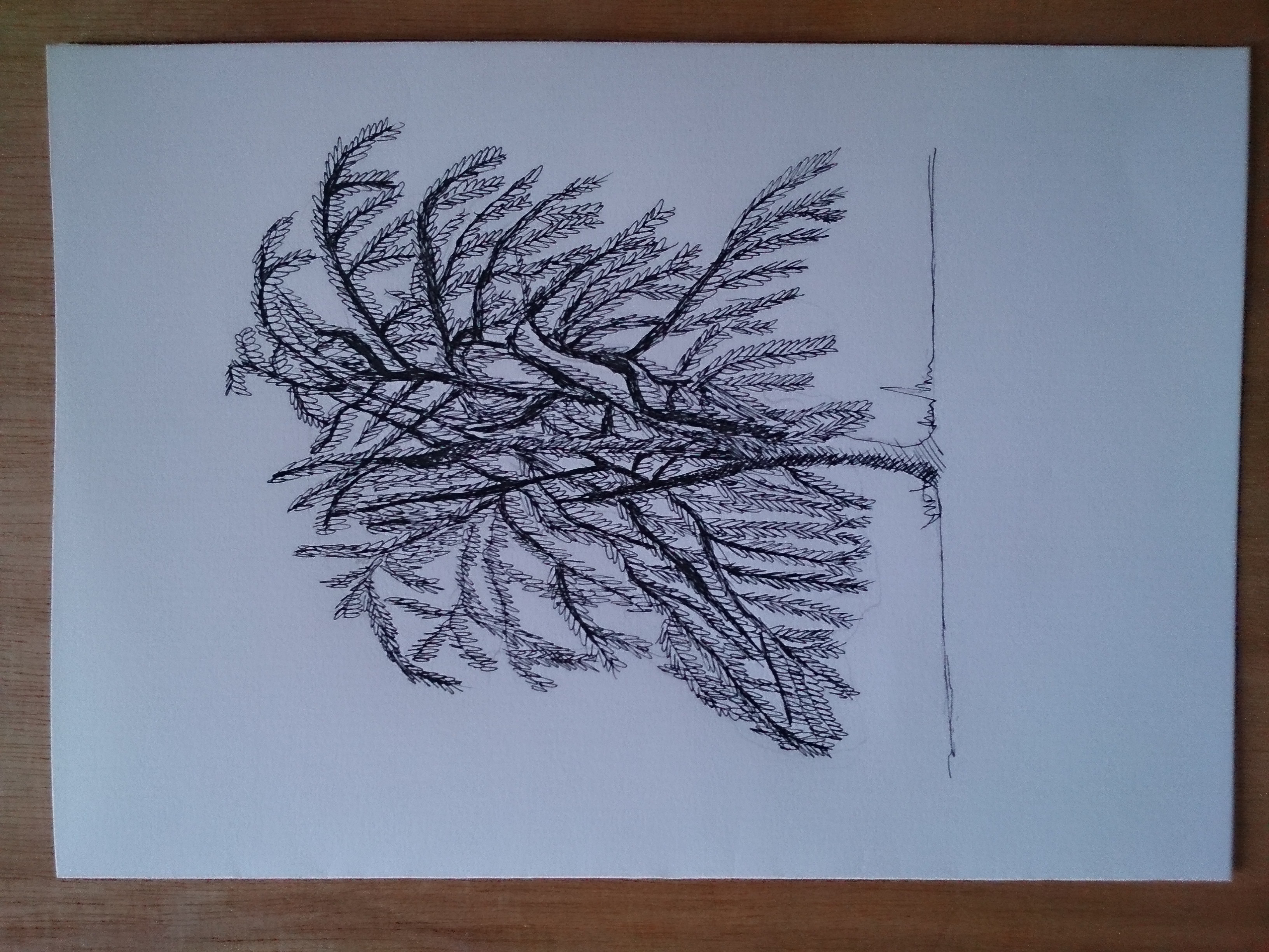
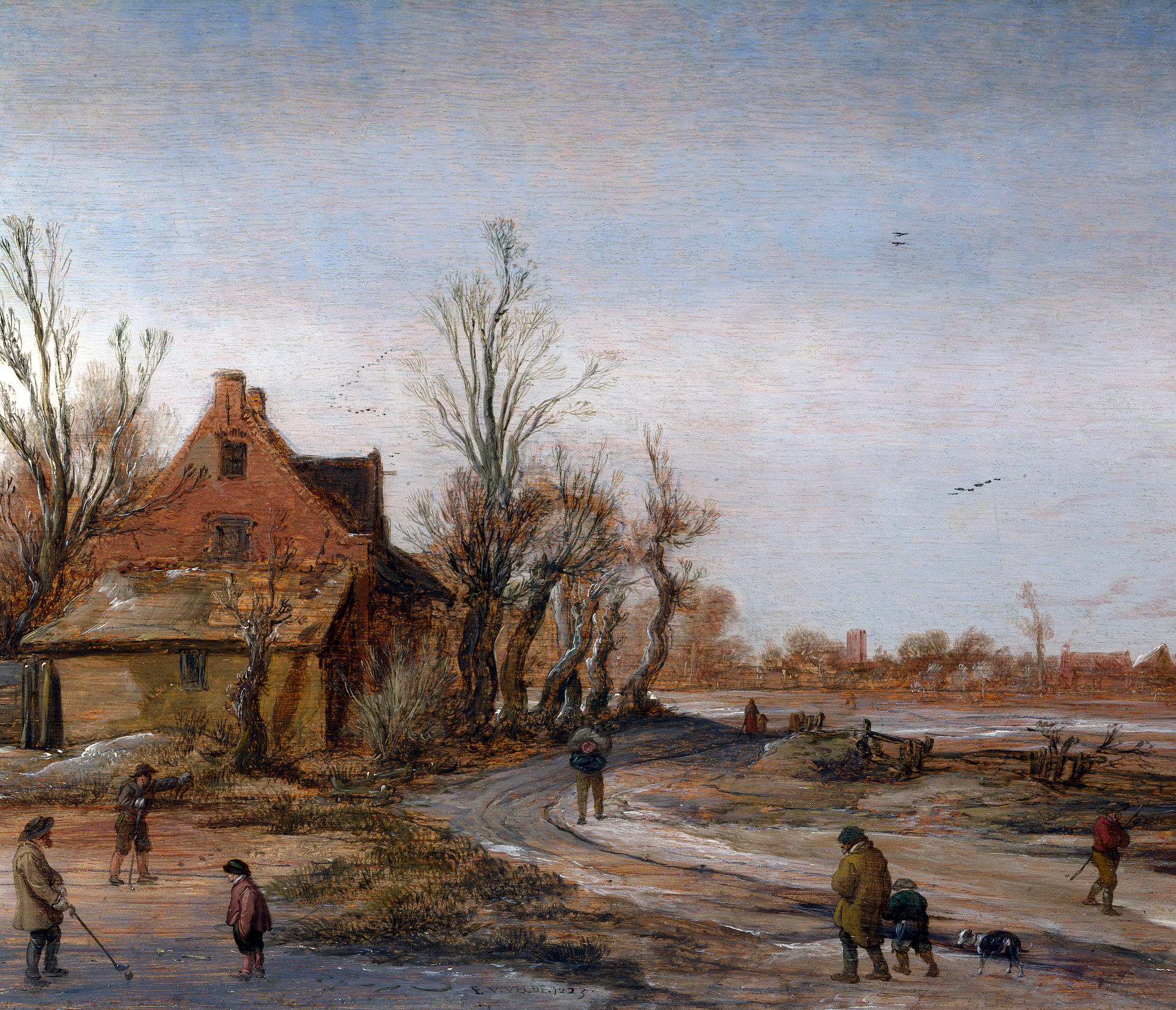
Exercise 3 – Study of Several Trees
Page 89

Also Trees in the park across the road from where I live.
1) I used shape and implied texture to distinguish one species from another, notice the bark on the silver birch.
2) I used squiggles of Ink applied very quickly and loosely with a brush to describe the foliage and spaces.
3) I let the white of the paper describe the light.
4) Although it may seem as if I had drawn a lot of detail, in fact I hadn’t. By carefully selecting the main shapes and direction of the tree trunks and carefully placed blocks of different shades of simple squiggles to suggest foliage, I merely suggest detail. Keeping it simple was key to this drawing. I think I would have gone crazy if I had tried to draw lots of detail.
Project 2 – Landscape
Research Point
Landscape Artists from Different era’s
Page 93
Introduction
The earliest landscapes were the frescos from the Minoan Greece of around 1500 BCE. Hunting scenes from ancient Egypt showed plants, animals and humans, but gave an impression of place, however, depictions of whole landscapes with some sort of perspective, developed in the ancient Greek Hellanistic period. Later, the Romans introduced the landscape, and their frescoes became enormous.
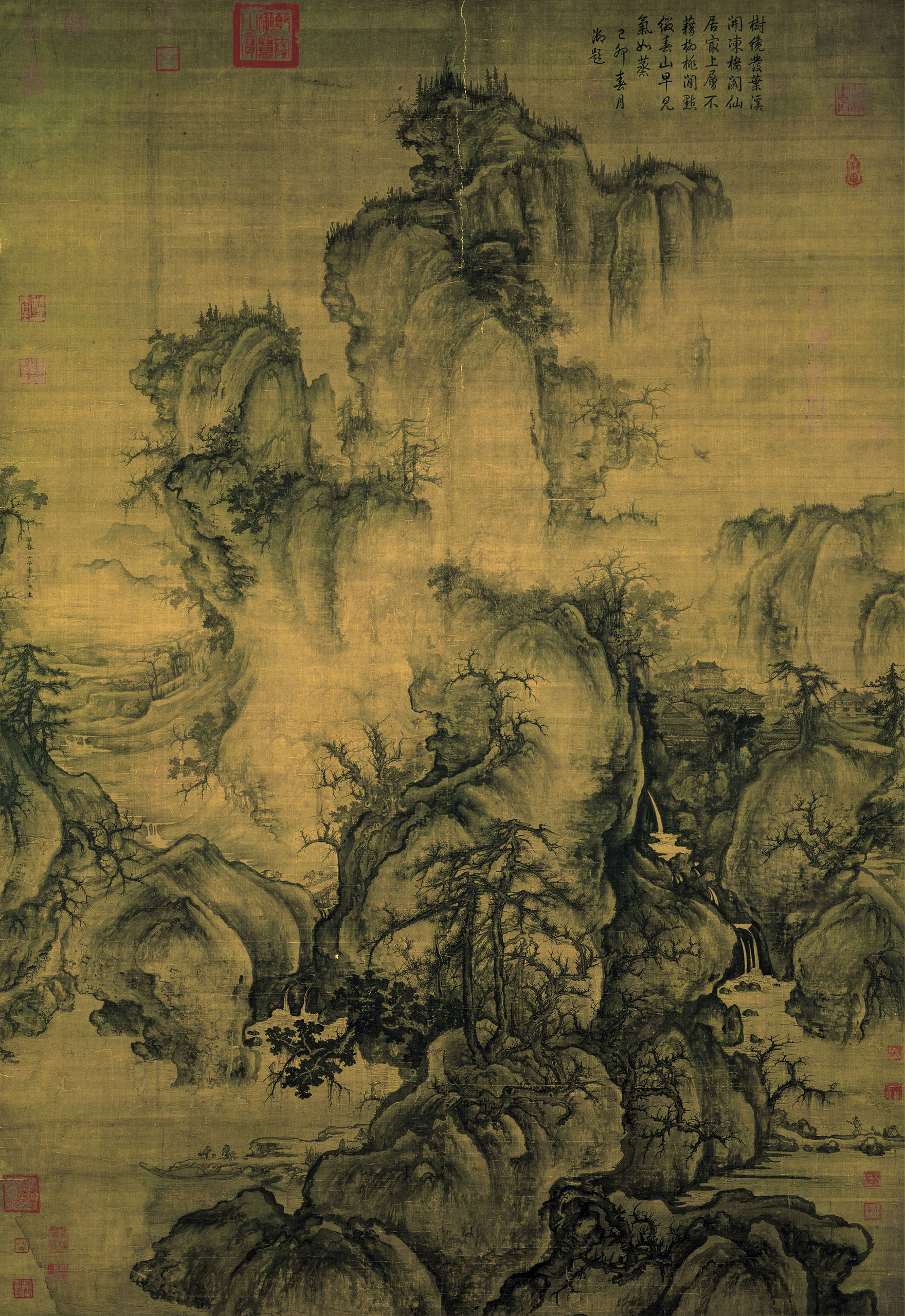
Sophisticated landscape backgrounds can be seen in ancient Chinese ink paintings (shan shui)
Medieval
Interest in landscapes disappeared almost entirely until the 15th century, when landscape painting was established as a genre in Europe, – as a subject for human activity, such as religious subjects.
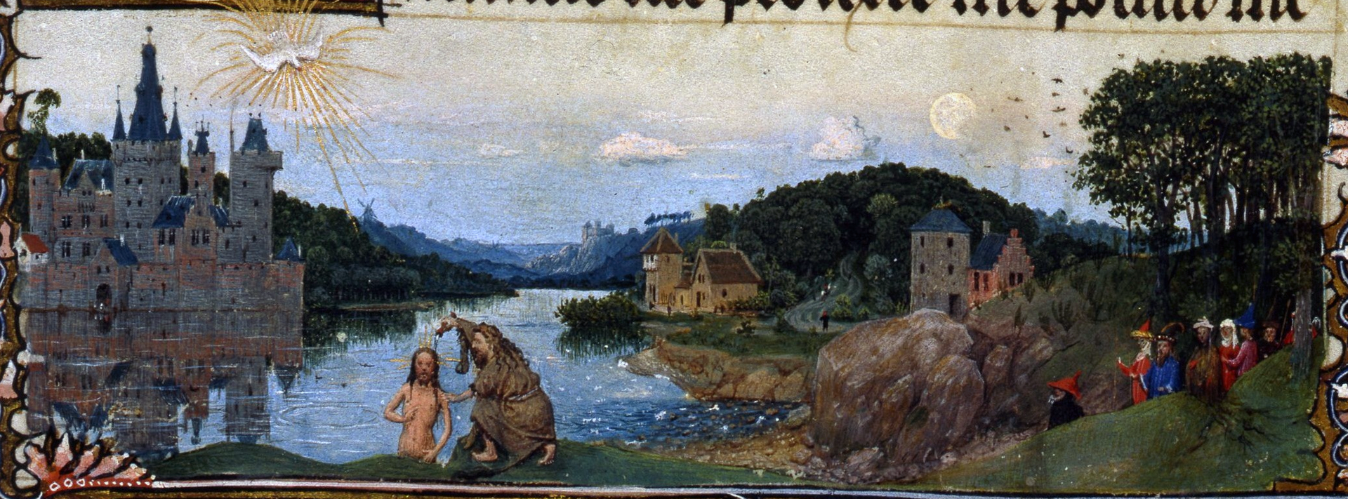
Hand was successful in producing effects of light, and progressions from foreground to the distant view. Something difficult for artists at that time.
Renaissance
Landscape backgrounds became more prominent and skillful, and around the end of the 15th century, pure landscape drawings and watercolours were seen eg: Leonardo da Vinci, Albrecht Durer, France Bartolomeo. In the early 16th century, Albrecht Althorpe and others of the “Danube School”

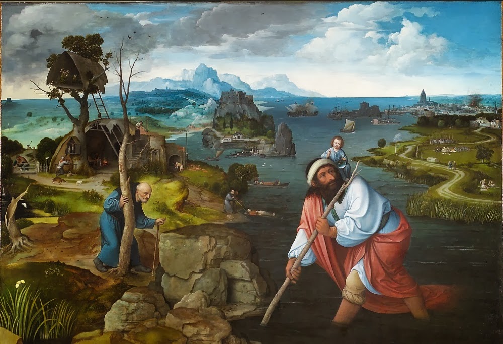
Joachim Patinir developed the ” World Landscape” (a panoramic landscape with small figures and using a high aerial perspective.
Georgio and Titian were two other important artists of the time who together, formed the Venitian School, which achieves much of its effects through colour and mood.
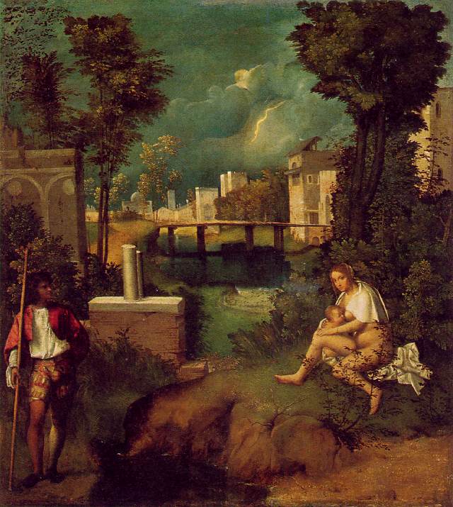
The Tempest has been called the first landscape in the history of Western painting.
The 17th and 18th century
Exotic landscapes were popular, one notable artist Frans Post, painted Brazilian landscapes.

Dutch Golden Age painting saw a growth in landscape painting. Realist techniques for depictions of light and weather were developed. Important artists were; Esaias Van Der Velde and Hendrick Avercamp. From the 1620’s the “tonal phase” of landscape painting started and Artists softened or blurred their outlines, and concentrated on atmospheric effect. Diagonals across the picture became popular and water often featured. Leading artists were: Jan Van Goyen, Saloman Van Ruysdael and Pieter de Molyn.
Landscapes in Flemish Baroque painting were often very large eg: Pieter Paul Rubens, who’s extravagant style emphasised movement, colour and sensuality. Landscape prints were popular, those of Rembrandt and the experimental works of Hercules Seghers are the finest.
English landscapes were mostly backgrounds to portraits. This english tradition was founded by Anthony van Dyke and mostly Flemish artists working in England, but 18th century watercolour paintings were mostly landscapes. Alexander Cozens wrote popular books on watercolour systems. Topographical prints were very also popular but were mainly of buildings, pure landscapes came about over the course of a century.
By the beginning of the 19th century the artists with the greatest reputations as landscape artists were; John Constable, JMW Turner, and Samuel Palmer.
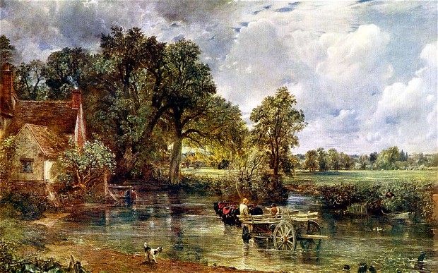
John Constable’s most famous paintings include: Dedham Vale and the Hay Wain. He drew and painted on the spot studies, and painted many full scale preliminary sketches to test his compositions. They had free and vigorous brushwork (revolutionary at the time) and continue to interest artists today.
The 19th and 20th Century
Interest in lansdscape art grew with the romantic movement. Remote and wild subjects became more prominent.
Caspar David Friedrich was a German romantic landscape painter, best known for his allegorical landscapes typically featuring silhouetted figures against night skies, morning mists, barren trees or gothic ruins. His work is often symbolic and seeks to convey an emotional response to nature. Alongside other romantic painters, he helped position landscape painting as a major genre within western art.
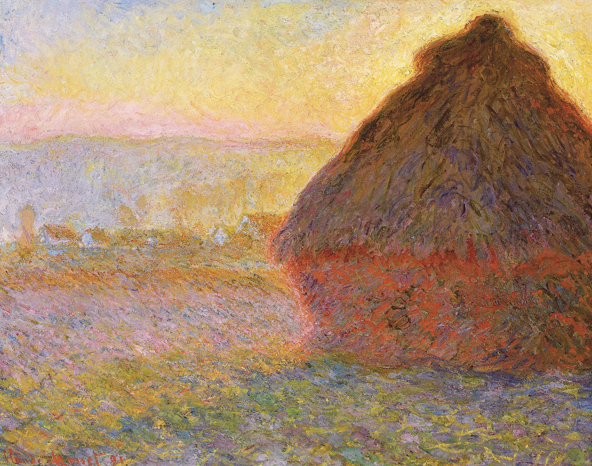
In the 1830’s, the French landscape tradition became the most influential in Europe with the impressionists and post impressionists. The name of the style derives from the title “impression, soleil Levant” (impression, sunrise) by Claud Monet. Characteristics of impressionistic paintings include small, thin, yet visible brushstrokes, open composition, accurate depiction of light, ordinary subject matter, movement and unusual visual angles.
Prominent in the middle to late 19th century was the Hudson River School in the United States, founded by Thomas Cole, who was well known for his realistic and detailed portrayal of the American landscape.
Post World War 1
Many significant artists still painted landscapes and continue to do so in a wide variety of styles. Eg: Neil Welliver, Alex Katz, Milton Avery, Peter Doig, Andrew Wyeth, David Hockney, Sidney Nolan.
Neil Welliver. American born (1928-2005) best known for his large scale landscape paintings. His style evolved from abstract colour field painting to realistic small town watercolour scenes. Then in the 1970’s he exclusively painted large scale oil landscapes, some measuring 8 x 10 feet and are richly painted abstractions and clear representational images of intimate landscapes. Subjects include: Rocky hills, beaver houses, tree stumps, and rushing water. He paints plein air sketches and continues in the studio.
Alex Katz, 1927. He is well known for his large paintings, featuring bold simplicity and heightened colours. His paintings are defined by their flat colours and form, economy of line and their cool but seductive emotional detachment. To me his paintings are very cartoon like.
Peter Doig (1959). His landscapes are somewhat abstract and are layered formerly and conceptually. They are frequently based on found photographs (and sometimes his own) and are not painted in a photorealist style. He uses unusual colour combinations and depicts scenes from unexpected angles, which give his work a magic realist feel. In 2007, his painting “white canoe” sold for $11.3million.
David Hockney (1937). Associated with the pop art movement. He was inspired to produce a series of swimming pool paintings in acrylic, whilst living in California. He rendered them in a highly realistic style using vibrant colours. In the 1980’s he began to produce photo collages (“joiners”) using Polaroid prints of a single subject. He arranged a patchwork to make a composite image. Because the photos are taken from different perspectives and at slightly different times, the result is work that has an affinity with cubism.
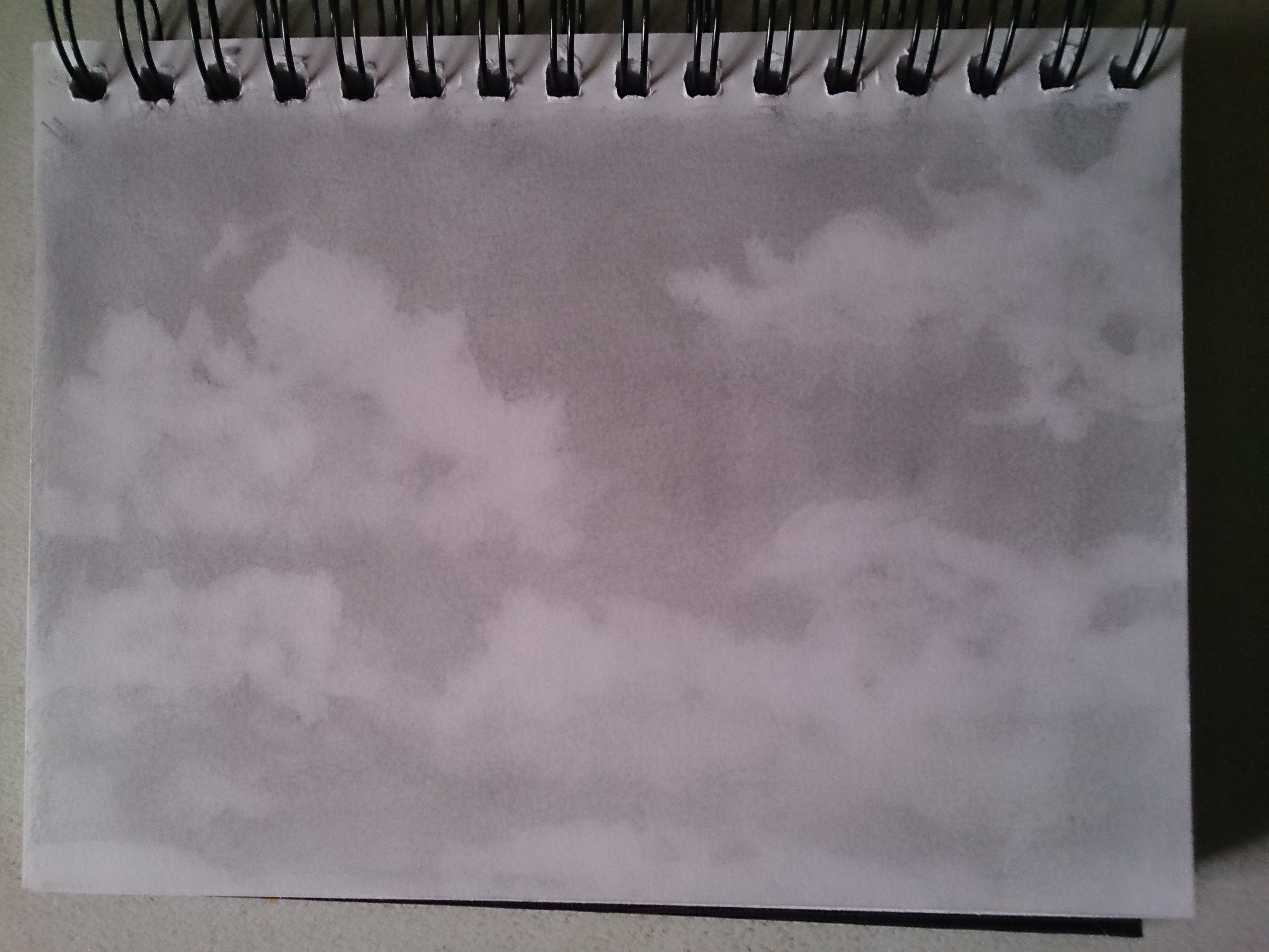
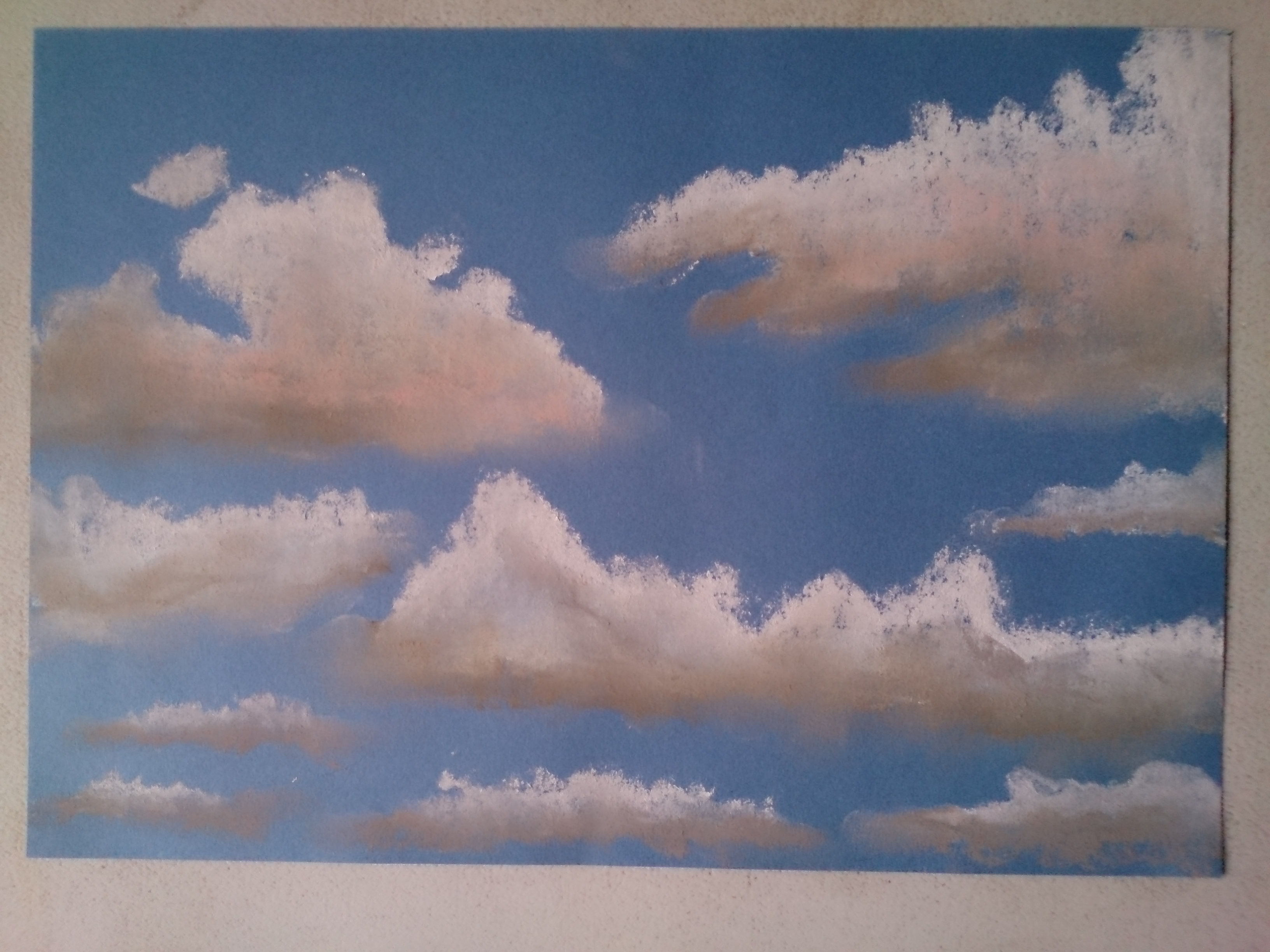
Exercise 1- Cloud Formations and Form
Page 94

Research Point – Vija Celmens
I watched a video of her at work in her studio on the Tate website, and was very taken with her absolute involvement with the piece she is working on. It seems that she investigates the subject to the enth degree, recording every minute detail monochromatically, to the point that nothing else matters or exists in that moment of intense concentration or meditation. Her powers of observation must be be very honed, it is this that could help me draw clouds.
Exercise 2 – Sketchbook Walk
Page 95
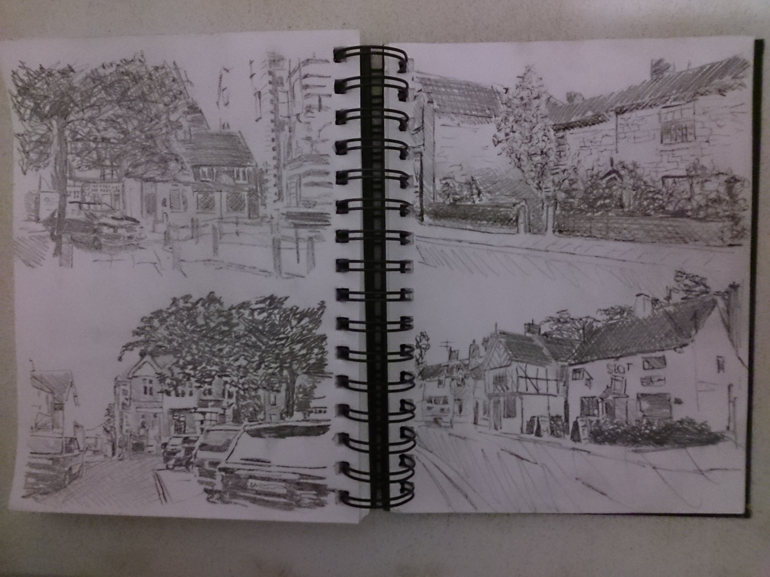
I took a graphite pencil, 0.5 mechanical 4B pencil and pocket sketchbook. I started with the graphite pencil but soon realised I hadn’t got a pencil sharpener so only had one pencil to try and just grab the main blocks of tone and texture. I was well out of my comfort zone, trying to lean on the wall to steady myself or rest on top of a car roof top. I should have gone to the park with a fold up chair and a flask of tea instead. Nevertheless it was fun. But I prefer working indoors.
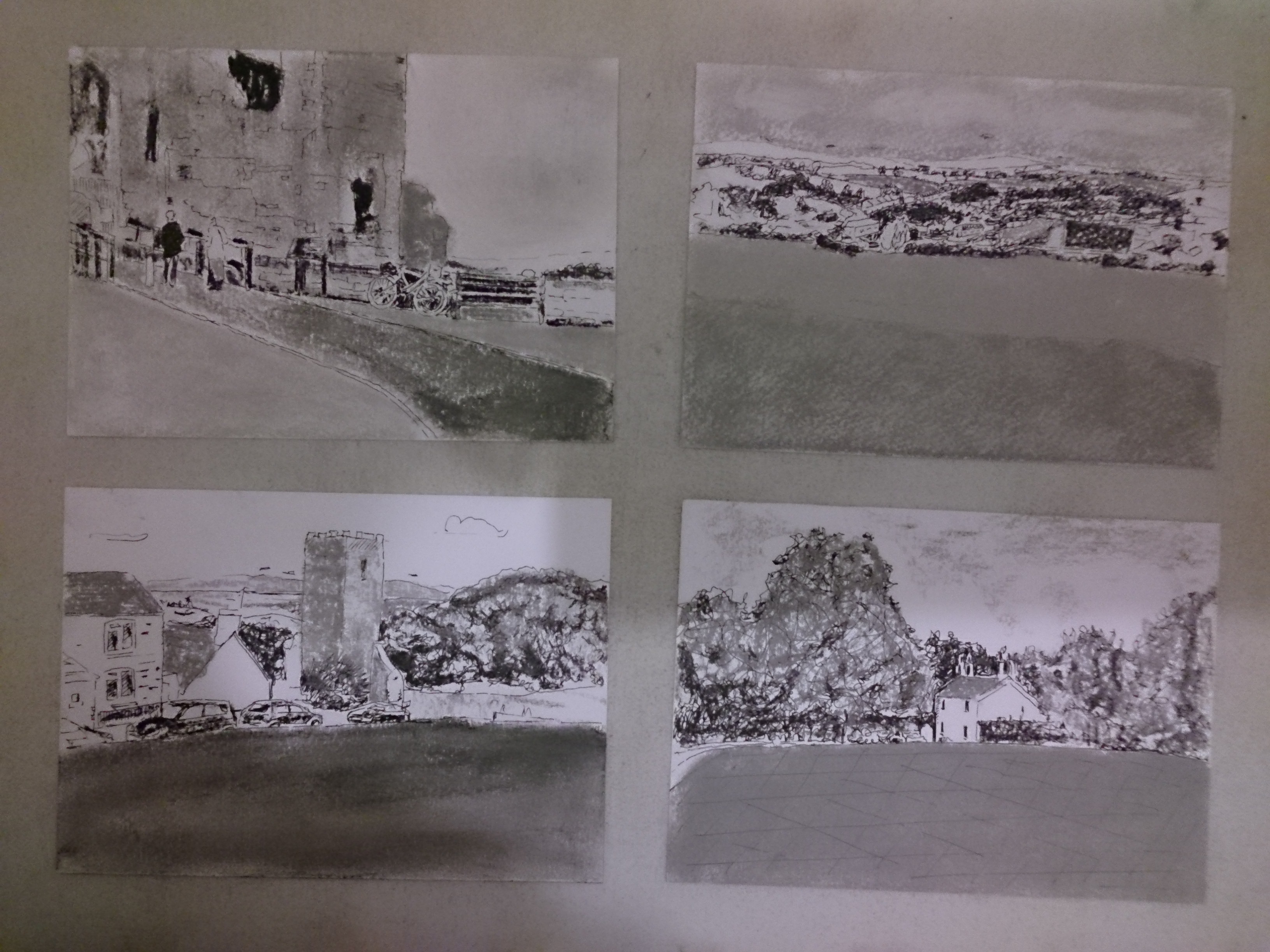
Exercise 3 – 360 degree Studies
Page 96

Research Point
Page 96
Artists who work in series with landscapes
Pieter Bruegel the Elder – 1525-1569 Netherlands – Often painted in series. One such commission was for “Months of the Year”
Claude Monet – he consistently depicted landscapes around Paris and the Normandy coast. He was introduced to plein air painting by Eugene Boudin. His each of his series paintings; Haystacks, Poplars, Rouen Cathedral, he painted the same site again and again, recording the changes with the time of day.
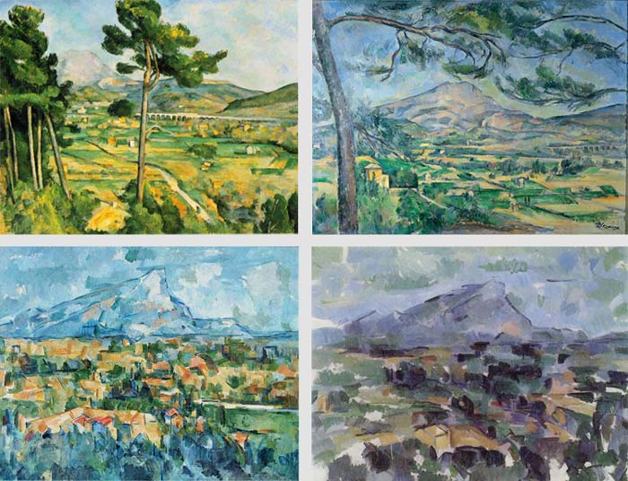
Cezanne painted many views of the Montagne Sainte-Victoire between 1882-1906
Fred Williams – 1927-1982 Bushfire Series
This is one of a series inspired by Bush fires that regularly ravaged the land close to Williams’s house at Upwey. The resulting paintings ranged from representations of the scorched earth and trees, to images of the New life encouraged and released by the fire.
Project 3 – Composition
Research Point
Page 97
Composition, simply put, is the arrangement of visual elements in a work of art, or “putting together” aplied as design.
The elements of design are;
Line -( the visual path that the viewer takes through the work.), colour, texture, tone, form, space and depth.
Priciples of organisation:
The artist decides the centre of interest and combines the elements into a harmonious whole, producing a statement. Some principles of organisation are; shape and proportion, position, field of view (cropping), the path or direction, negative space, colour, contrast, geometry eg; the golden mean, lines and rhythm, lighting, repetition, perspective and rule breaking.
Compositional Techniques
There are numerous techniques to achieving unity within an artwork. Some of which, are;
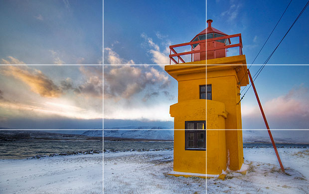
The Rule of Thirds: a simplification of the golden mean, the idea is to prevent the areas of interest from bisecting the image, by placing them near one of the lines that divide the image into three equal columns and rows, ideally near the intersections of those lines.
The Rule of Odds – suggest that an odd number of objects in an image avoids symmetry therefore adds more interest.
The Rule of Space – can be used to suggest the illusion of movement or conceptual bubble in the viewers mind, eg; leaving space in the direction of the sitters gaze or space in front of the portrayed runner instead of behind.
Simplification – Clutter in an image can detract from the main elements with the picture. Clutter can be reduced by good use of lighting, brighter areas draw the eye, as do lines and colour. Less dtailed work towards the edges alxo help, eg; in a landscape the distance becomes greyer and less defined.
Geometry and Symmetry – related to the rule of thirds. Also triangles are pleasing to the eye, eg; the eyes and mouth in a portrait form a triangle.
Creating Movement – Good use of the above techniques can keep the eyes moving around the image, therefore avoiding a static image.
Other Techniques
* There should be a centre of interest.
* The eyes should be lead around all elements in a work.
* The subject should not face outwards from the image.
* Exact bisection of the image should should be avoided eg; The horizon should not be dead centre.
* Small, high contrasting elements have as much impact as large dull elements.
* The prominent subject should be off centre (rule of thirds) or be balanced by smaller elements.
* The spaces between objects should be varied to avoid monotony or patterns.
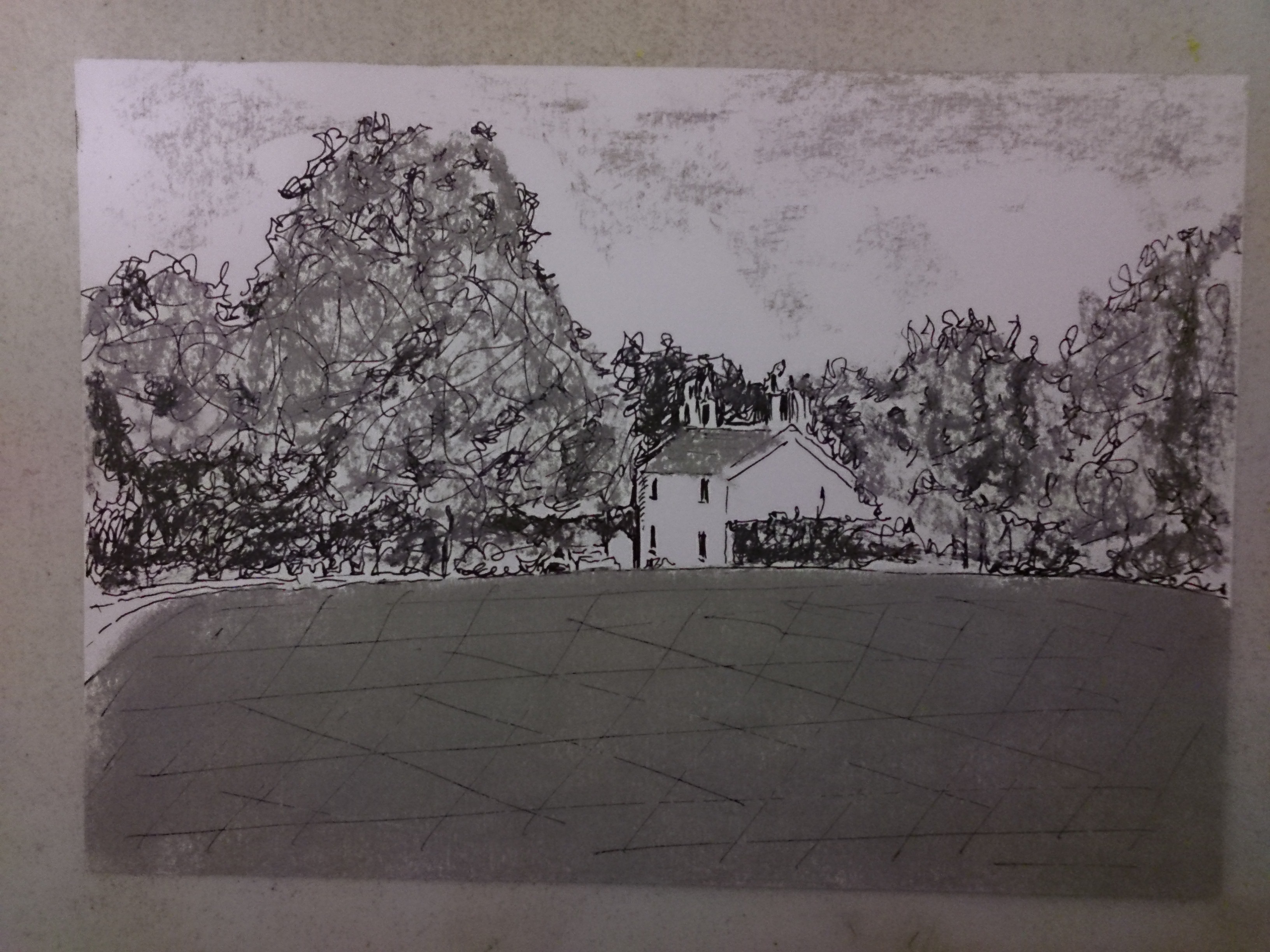
Exercise 1 – Developing your Studies
Page 98
Drawn from preliminary sketches, photo and imagination (clouds and trees). Composition based on rule of Thirds, note textures, reflections, and shadows inside the cars and on windscreen. I tried to include all the elements of landscapes that I have learnt about so far. And tried to capture the light slightly off centre. Cloudy overcast day, as usual in this part of Wales.
Research Point
Page 99
Comparisons of approaches to landscape art by past and present artists.
Comparison: Nicolas Poussin with Paul Cezanne
Poussin (b.1594) Planned every element of his style, from contour lines, colours, to ancient art and philosophy as his inspiration. His obsession with planning makes his paintings very impressive, although his critics often see his work as “cold and stiff”. Paul Cezanne (b.1839) was a follower of Poussin who served as a major inspiration to him. Obviously more abstract than Poussin, he wanted to paint a vision of exactly what he saw, but reduced to abstract form and colours. Similar to Poussin, Cezanne included figures in his landscapes and sometimes included groups of large, heavy figures. But unlike Poussin, he worked from direct observation and developed a “light and airy” painting style.
Comparison: Tacita Dean with George seurat
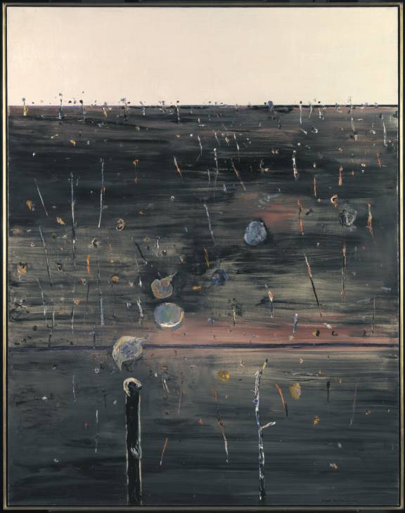
Tacita Dean’s series of dramatic large scale chalk on blackboard drawings, “fatigues” (white on black) were created in a large two story building and are truly huge in comparison to Seurat’s tiny “landscape with houses”, drawn with black conte crayon on white paper (black on white) measuring approximately 10 x 12 inches. Although very opposite in size, they have a similar dramatic monochromatic atmosphere about them.
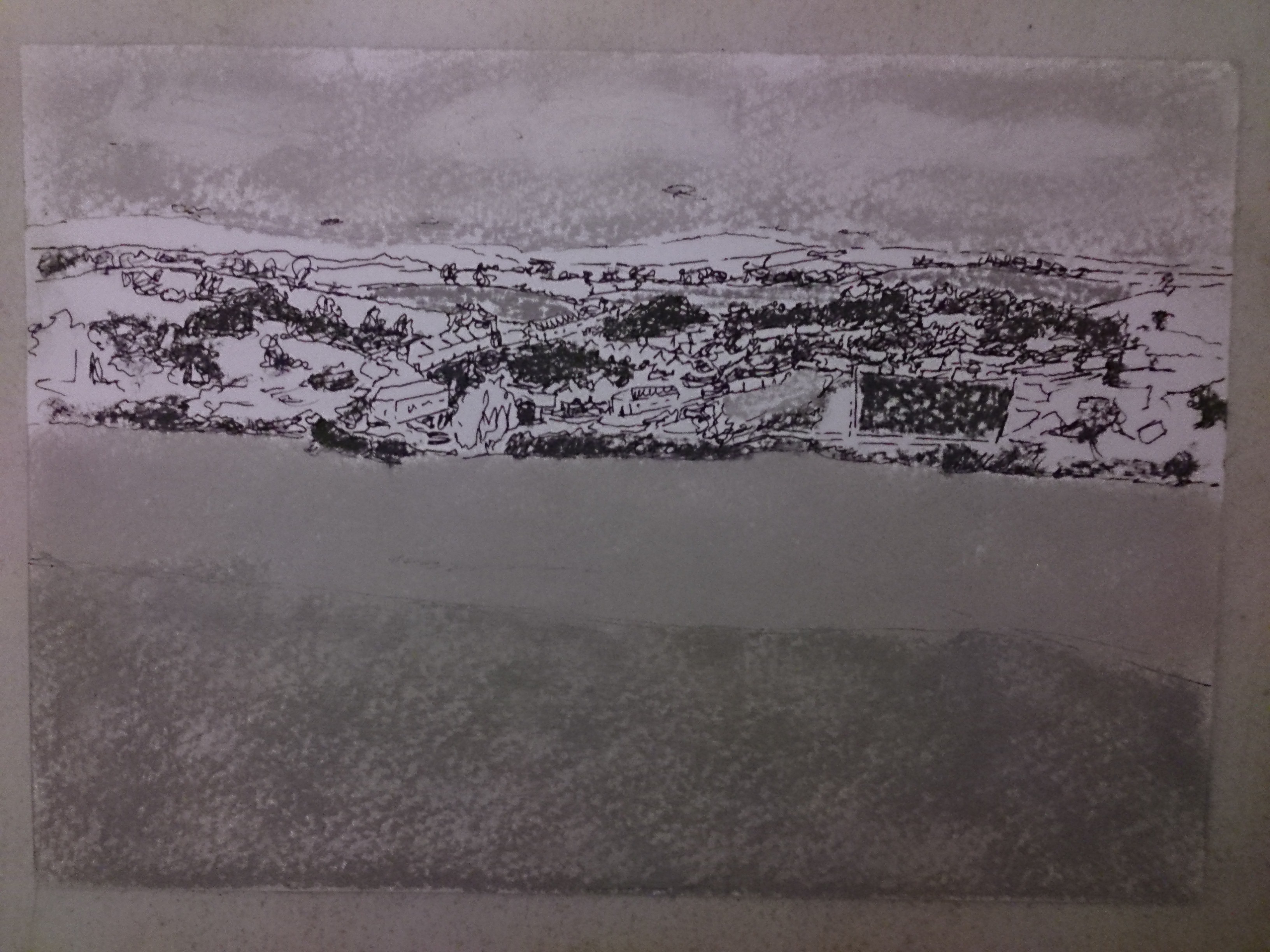
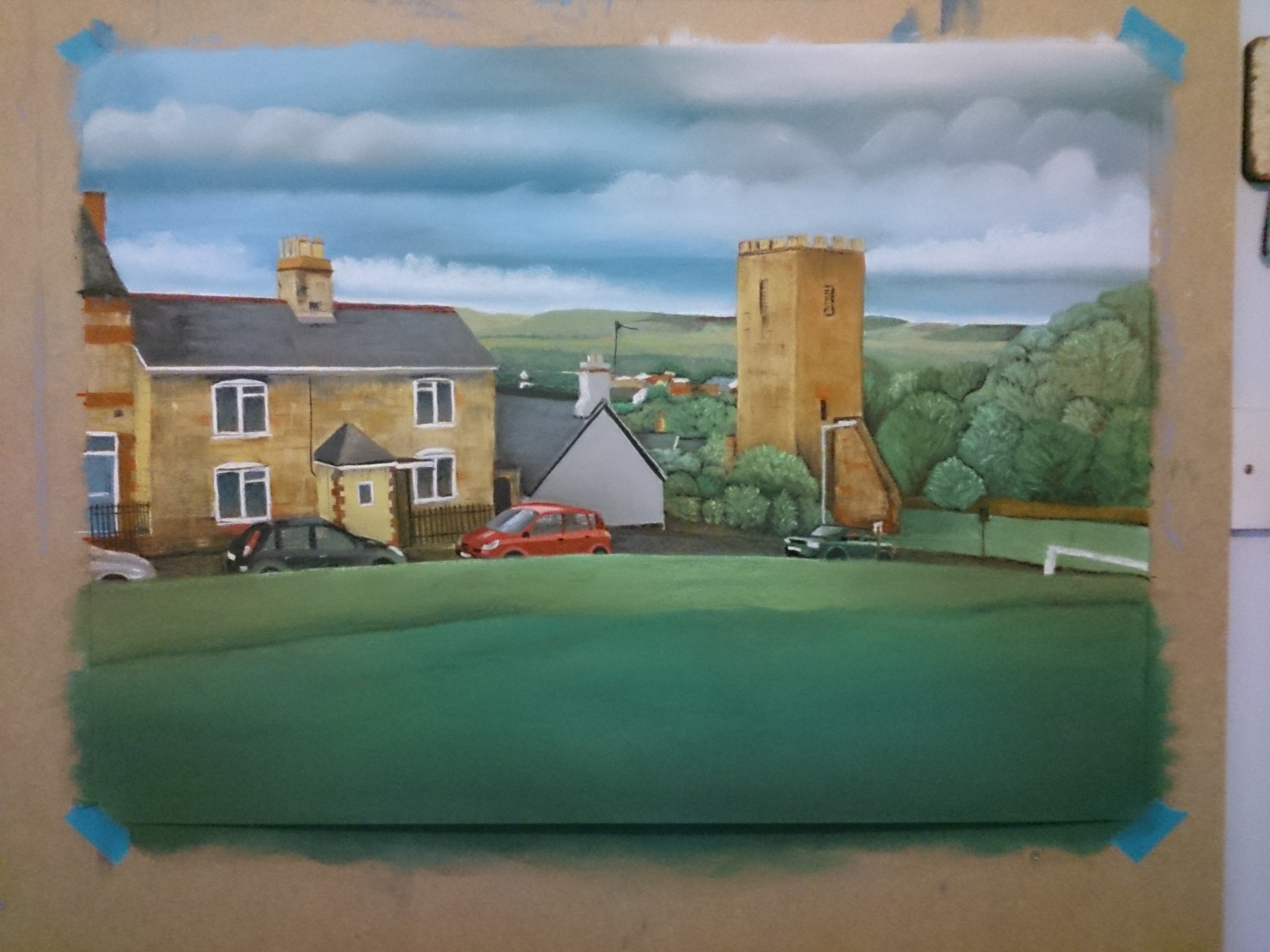
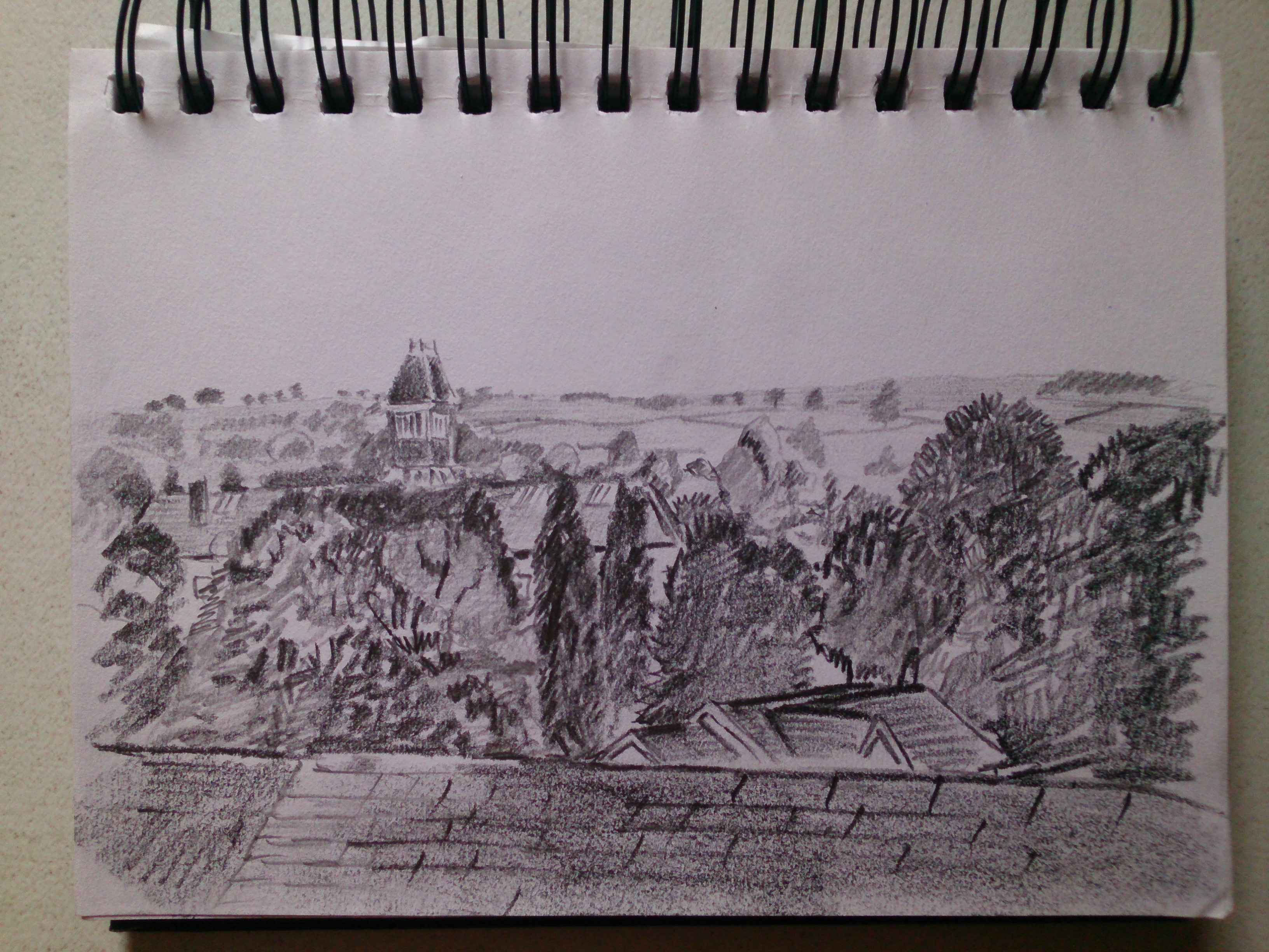
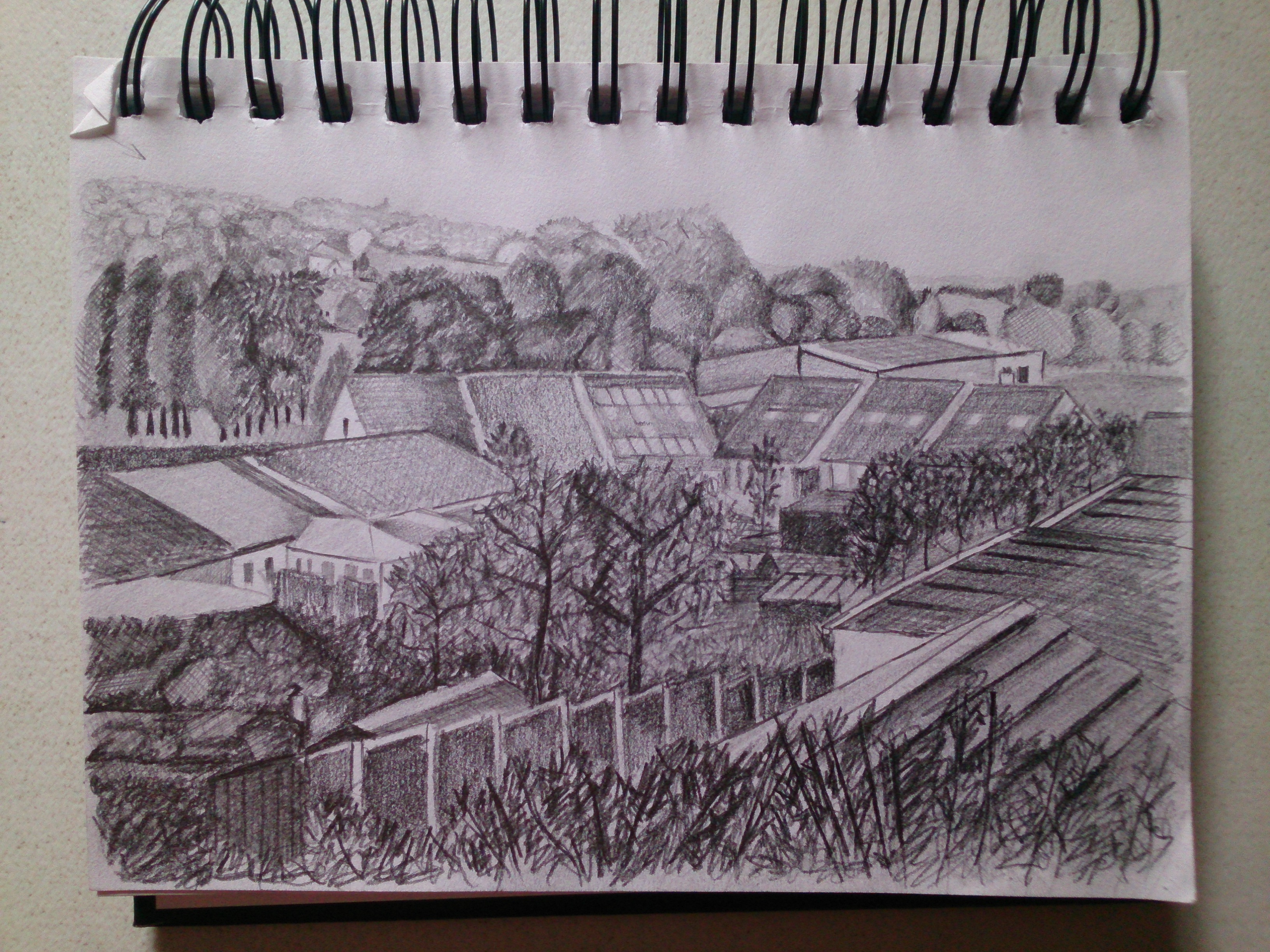
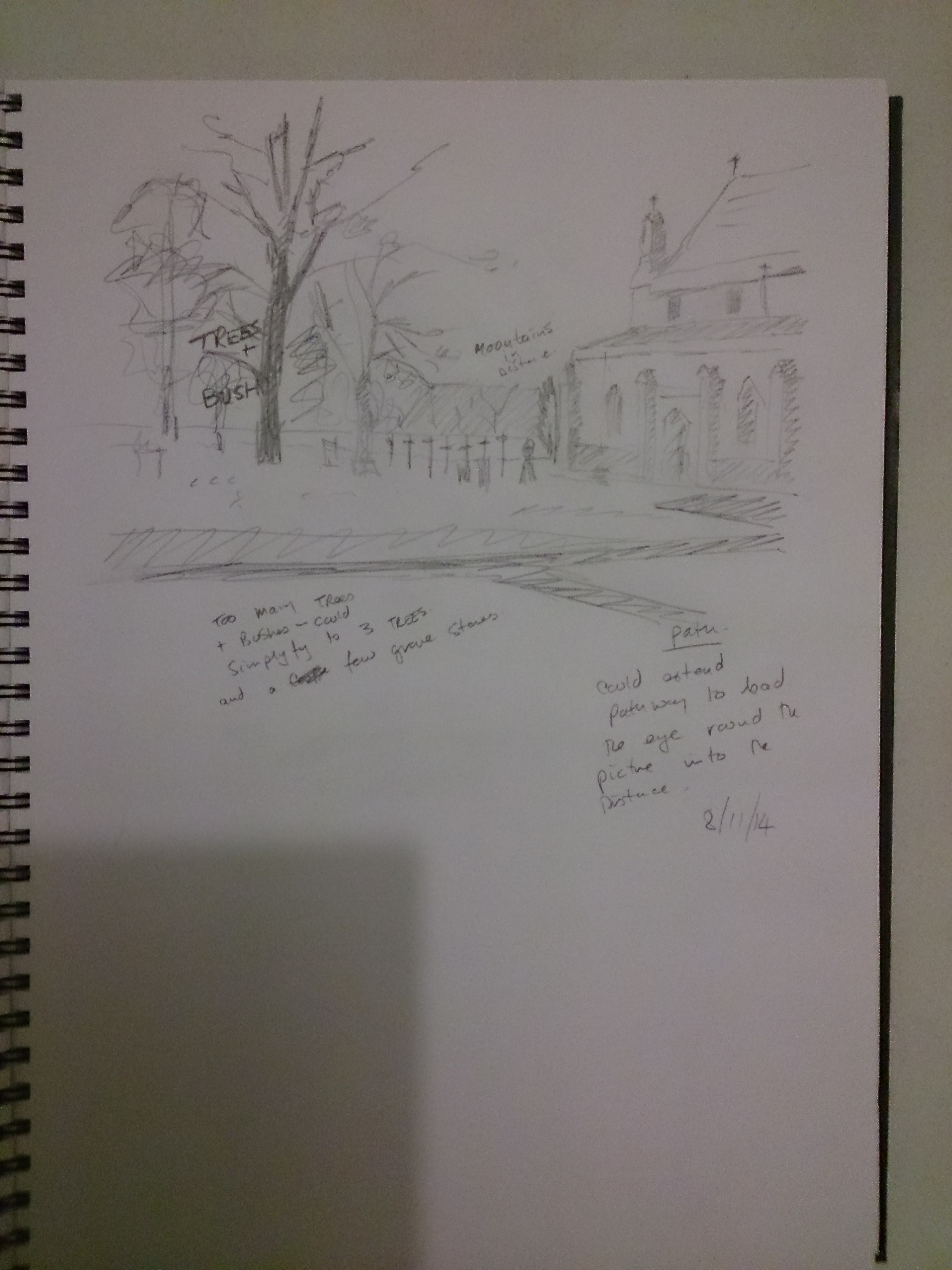
Exercise 2 – Foreground, Middle Ground, Background.

Although exercise 1 would have also included this criteria, I felt that I wanted to try something else extra. So I took a walk to the medieval church behind our flats, and drew this from the graveyard looking over the houses in the valley and up to the Clwyd mountains in the far distance.
1) I started these drawings by sketching loose simple, shapes and forms but in the end I personally like to draw what I see. I found/find that preliminary sketches cloud my creativity and spontaneity. I simplified by using texture insted of detail, such as clouds, grass, trees, roof tiles etc, and contrast for reflections on car windscreens. I find that blocking in simple shapes and shadows first, then layering tones and textures on top of one another, create the illusion of detail and form.
2) once again I tried to receed the distance by weakening and greying out detail and shading. Creating tonal values similar to the horizon creates the illusion of far distance.
3) I think I used light and shade successfully.
4) As stated earlier, I find that too much preliminary work stifles my creativity, and am afraid of getting bored with the subject. Therefore I like to draw what I see.
Project 4 – Perspective
Exercise 1 – Parallel Perspective – An Interior View
page 106
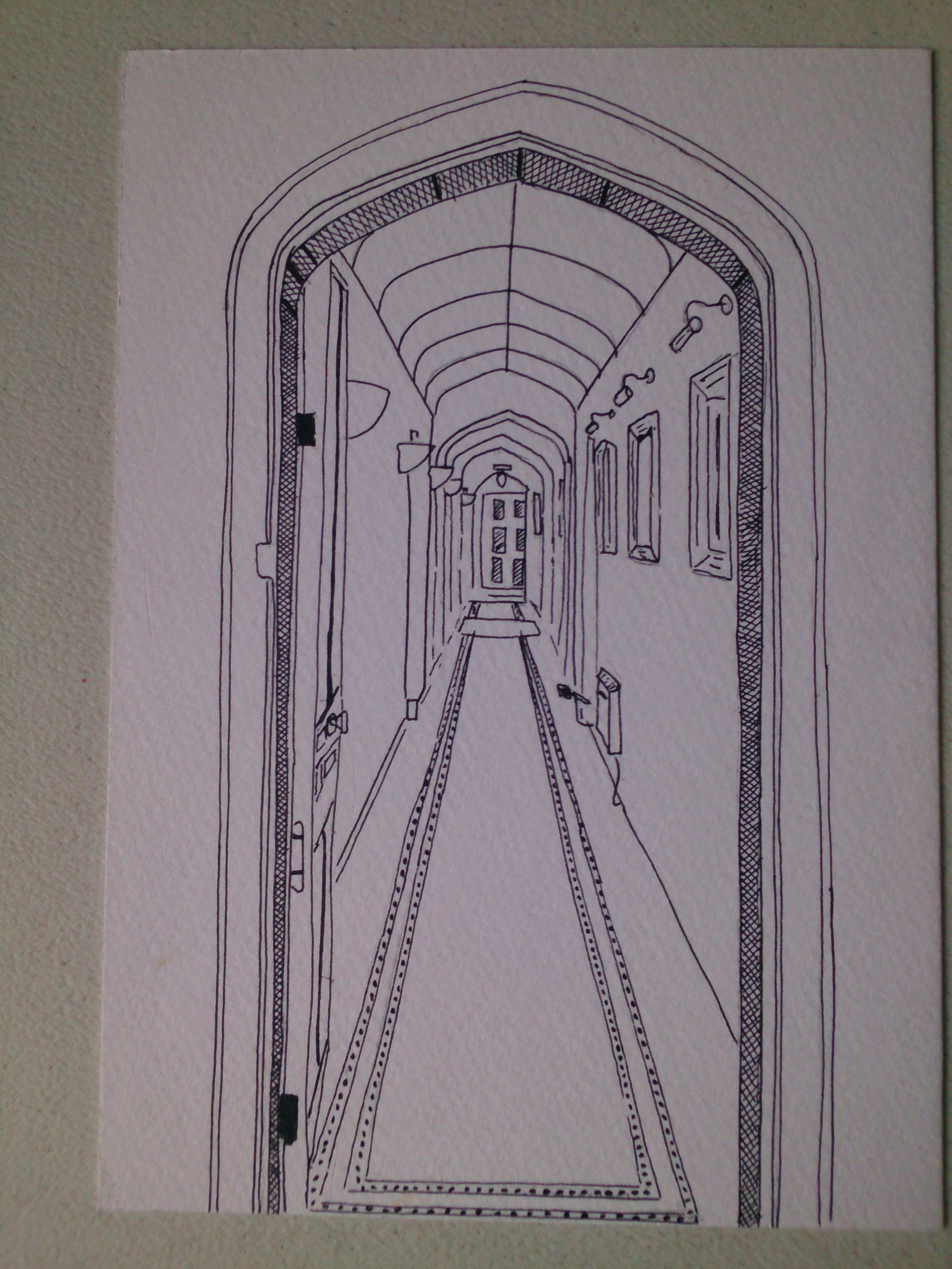
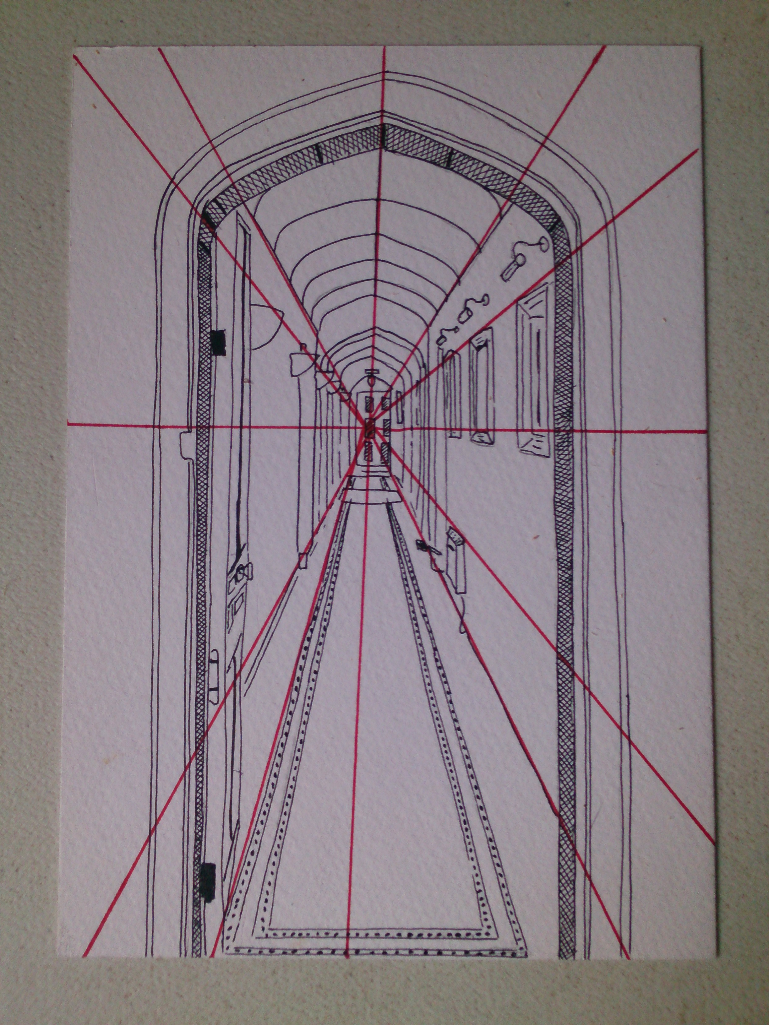
my sketch is accurate as far as perspective is concerned, my method makes use of a perspex cross hairs grid and a proportional divider. Sometimes I use a plumb line and proportional divider. A ruler helps to draw in perpective guide lines.
Exercise 2 Angular Perspective
page 107

I had to take a photo of this building from the middle of the road, because it wasn’t practical to sketch it. The lines of perspective are visible on the building’s timber frame, so I won’t draw red lines on it to illustrate them.
Exercise 3 – Aerial or Atmospheric Perspective
page 109
Previous drawings also demonstrate aerial perspective.
Project 5 – Townscapes
Page 111
Research Point
John Virtue – known for his “London Paintings” which were displayed in the National Gallery during his tenure as Associate Artist from 2003 -2005, which focused on the London Skyline. He uses easily recognisable landmarks from the capital, such as, the Gherkin, the NatWest Tower and St. Paul’s Cathedral.
His work borders between abstract and figurative and has affinities with oriental brush-painting and American abstract expressionism. They closely relate to the great English landscape painters Turner and Constable. He works solely in black and white on canvas, using white acrylic paint, black ink and shellac. In his own words, he says “I have no interest in recording a rhetorical history of London, really I’m interested in making exiting abstractions from what I perceive.
From my own point of view, I am a bit confused, because the current projects are dealing with parallel, angular and atmospheric perspective, none of which are present in any of John Virtue’s purely black and white abstractions (2 tones only). They are, however wonderful expressive abstractions.
Exercise 1 – Sketchbook of townscape drawings
page 113
It as rained everyday for weeks in the Clwyd valley so I haven’t been out and about with sketchbook and pencil in hand. So I moved on to the next exercise for the moment.
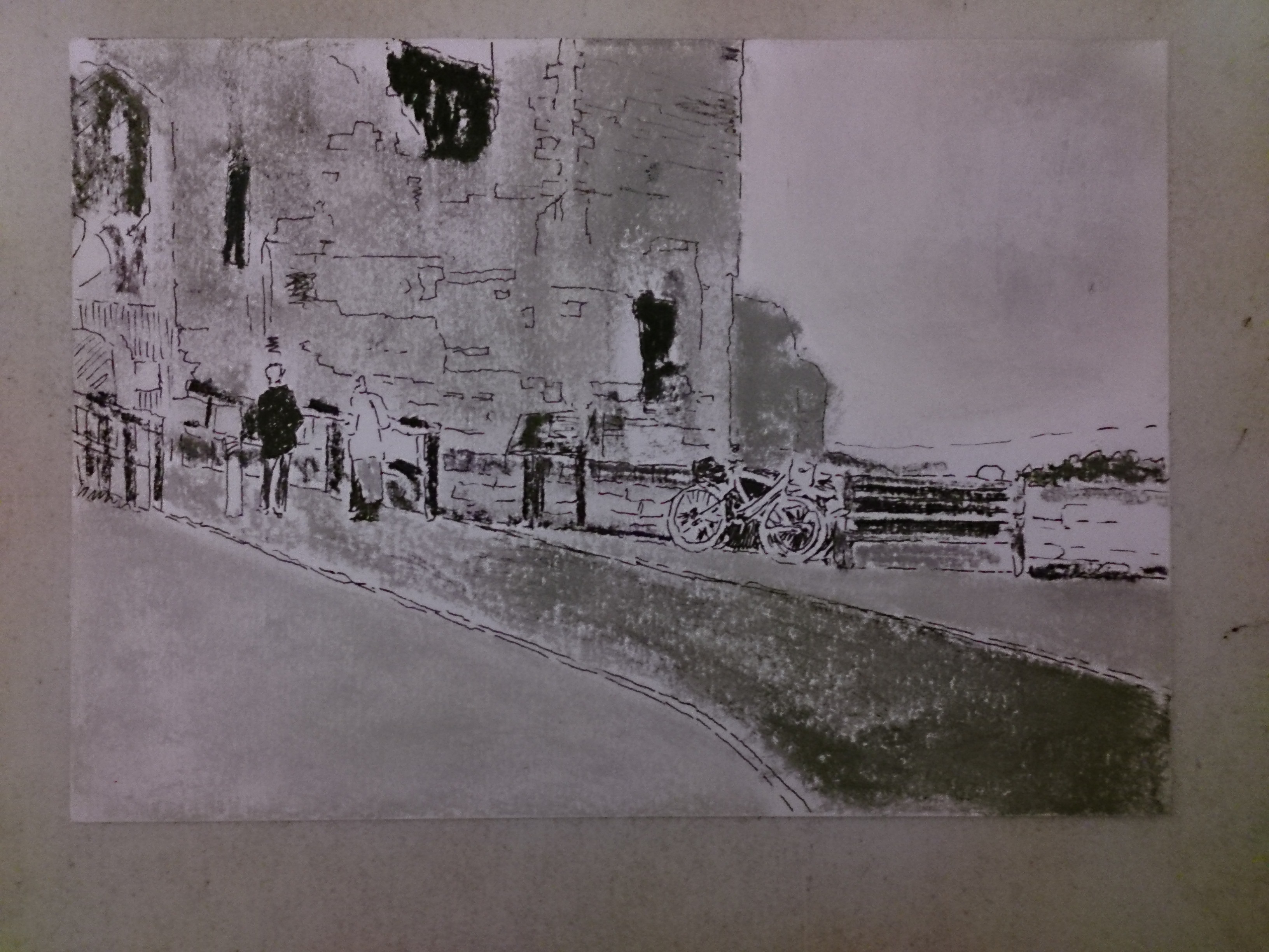
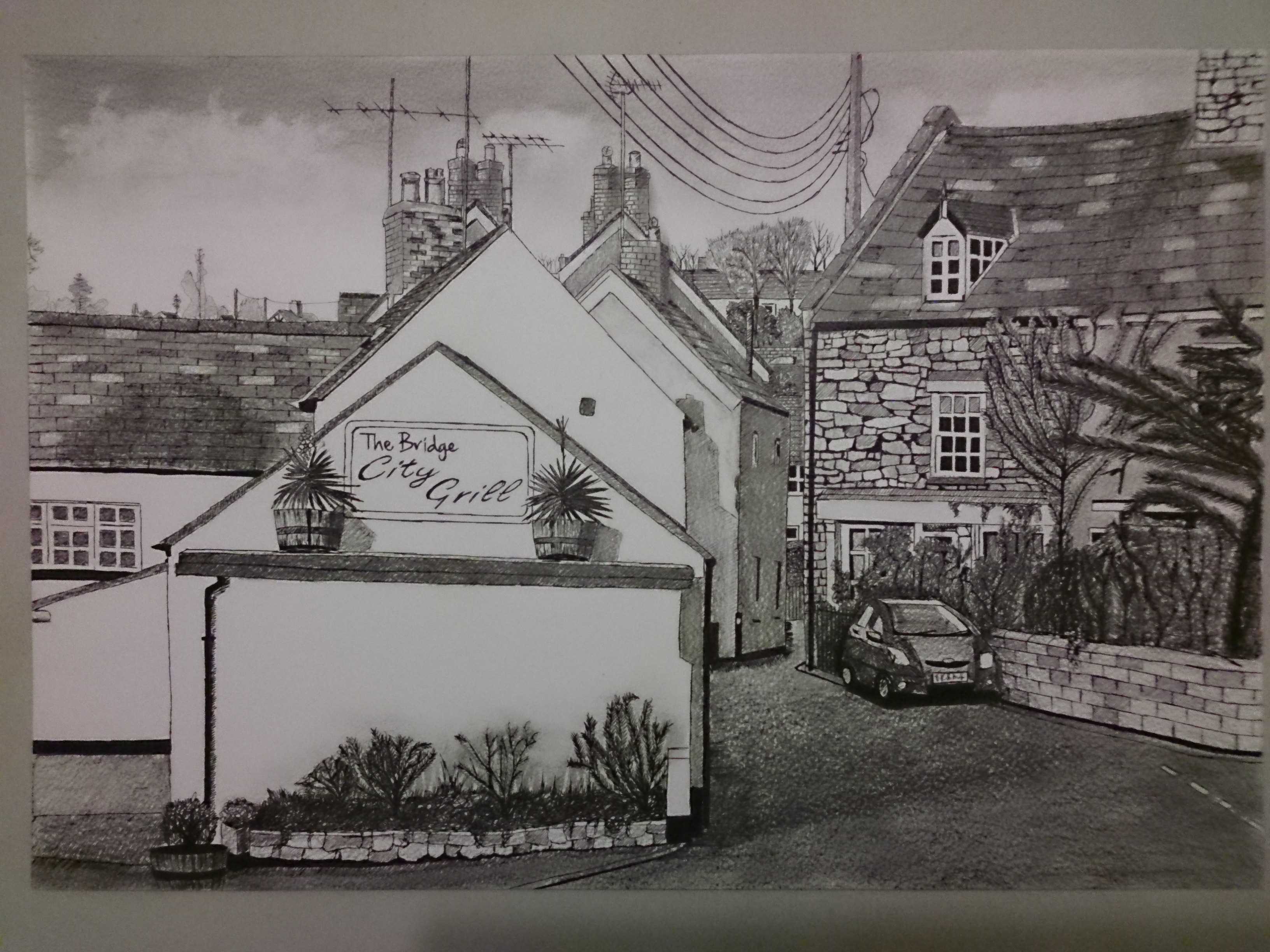
Exercise 2 – Study of a Townscape Using Line
page 114
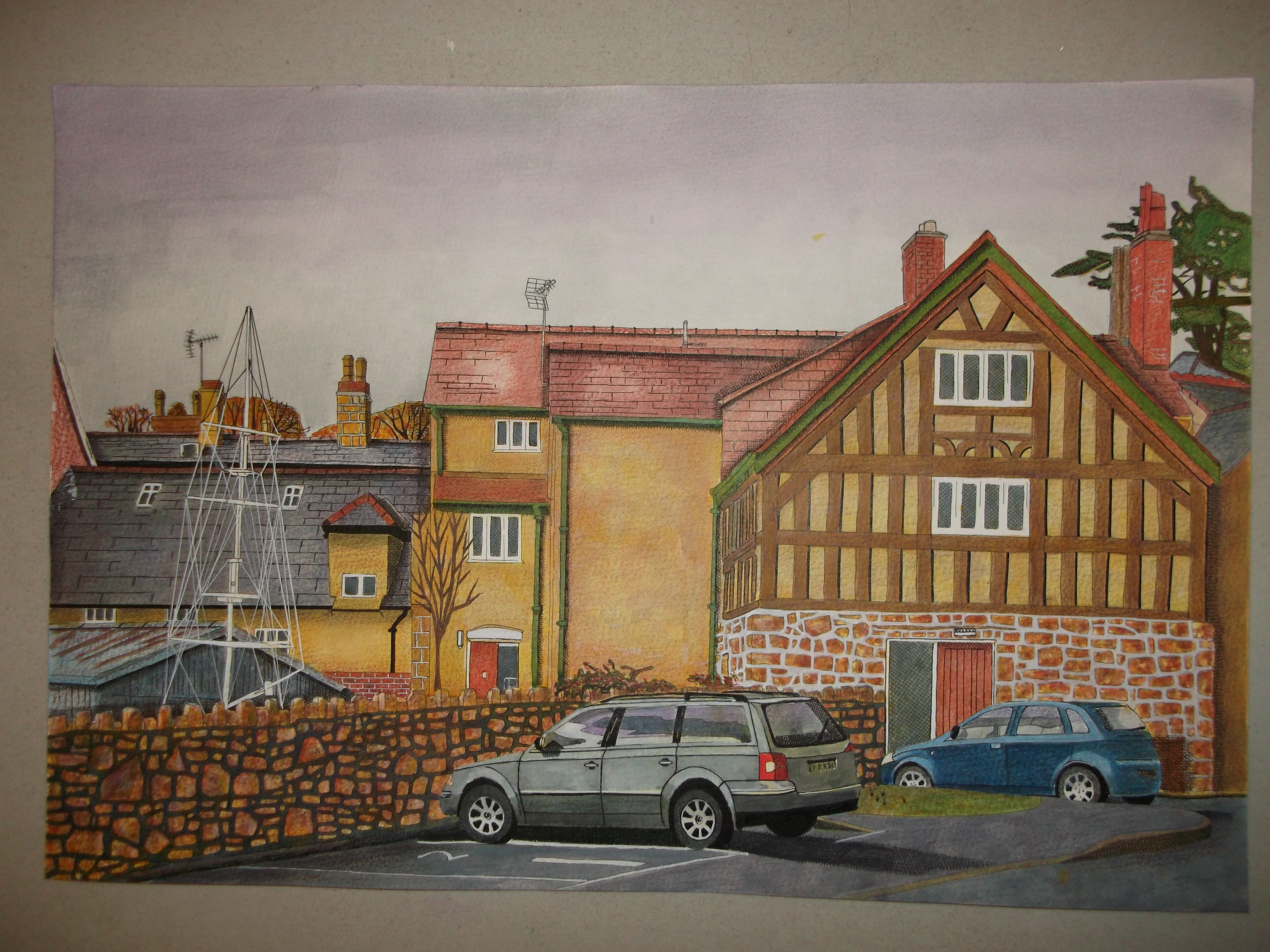
As the weather has been so awful here in Rhuthin, I drew this from a photo. I had explored for a few days with a small view finder and was inspired to draw this image of a 15th century building behind a shop along side a crooked boat’s mast outside the sea scouts hut. I started out with a line drawing, but thought I would add an ink wash for the overcast sky, it looked flat so I added a bit of purple. I got hooked and got carried away, and couldn’t stop. So it may look like a painting, but I promise its 100% a drawing.
Exercise 3 – A Limited Palette Study
page 115
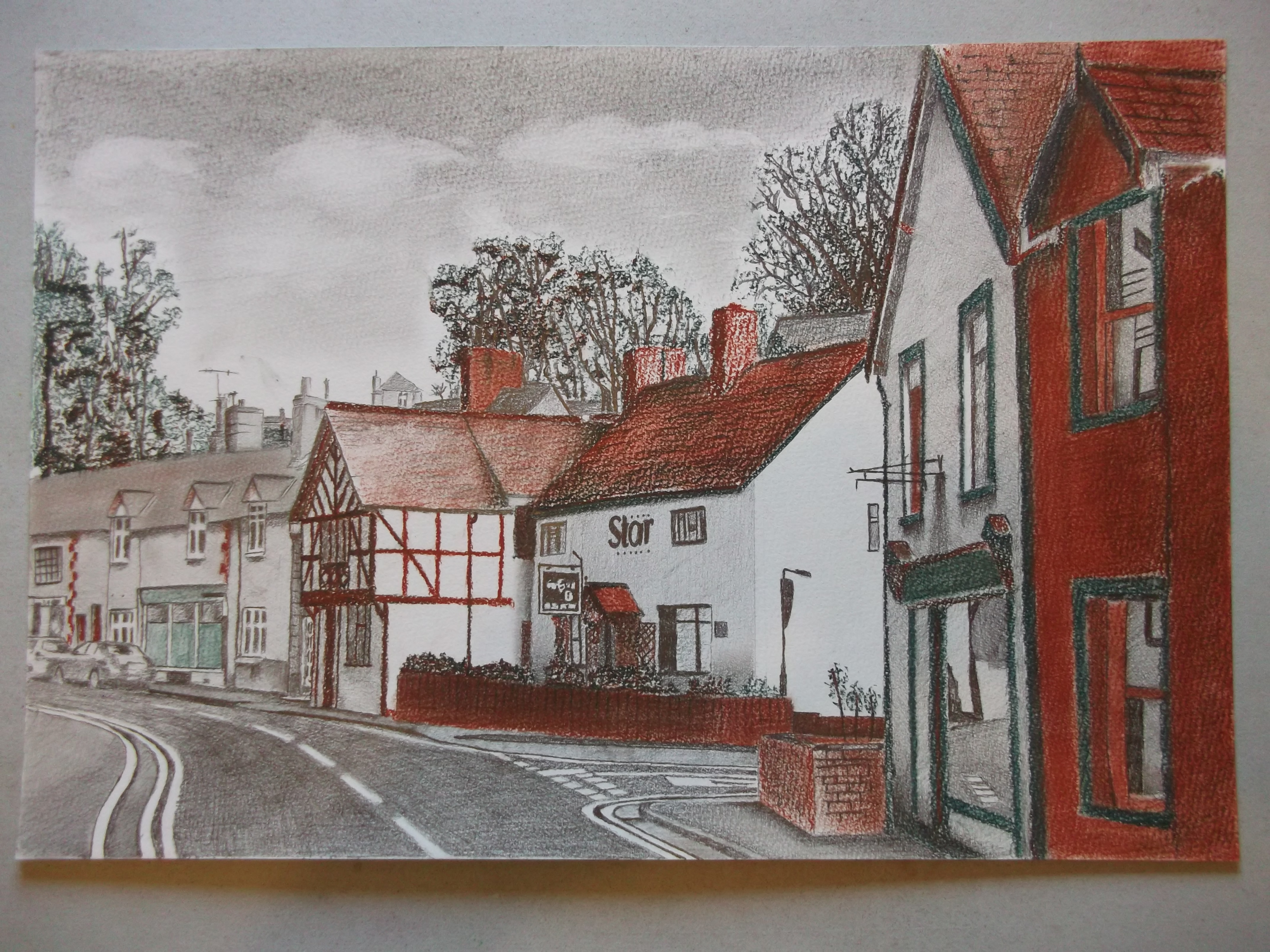
the two buildings on the right are the actual colours, sanguine (red) and white with green trim, which are contrasting colours, so red and green are my choice of limited palette. The two colours layered, gave me a a nice rich dark, which enabled me to create more depth when contrasted with the grey and white in the distance. Compare the huge tonal contrast between the two nearest houses and the furthest houses on the sky line.
Exercise 4 – Statues
page 116
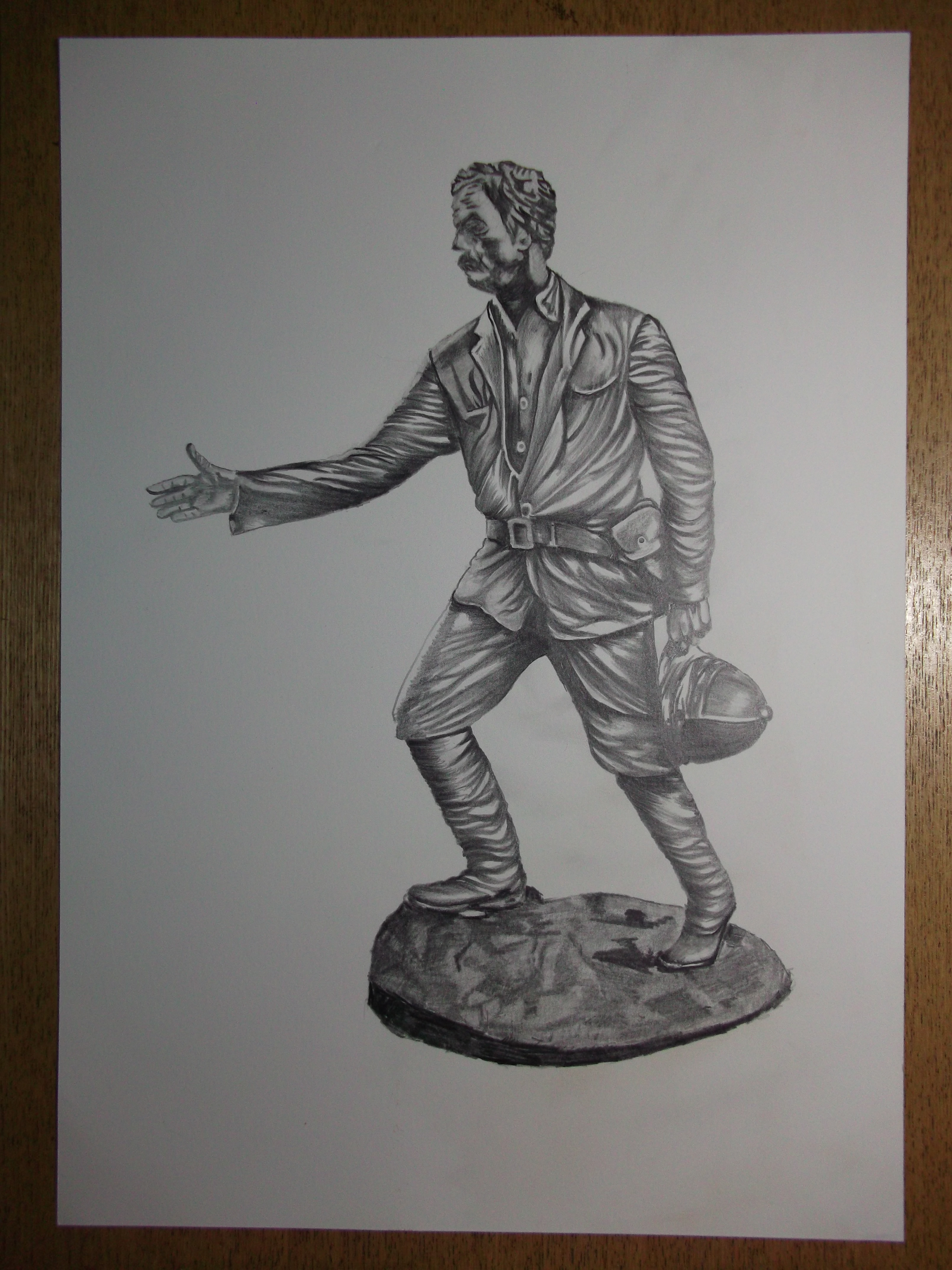
Statue of Sir Henry Mortimer Stanley born in Denbigh North Wales. This statue is life sized and stands on the pavement outside the library in town.
Assignment 3
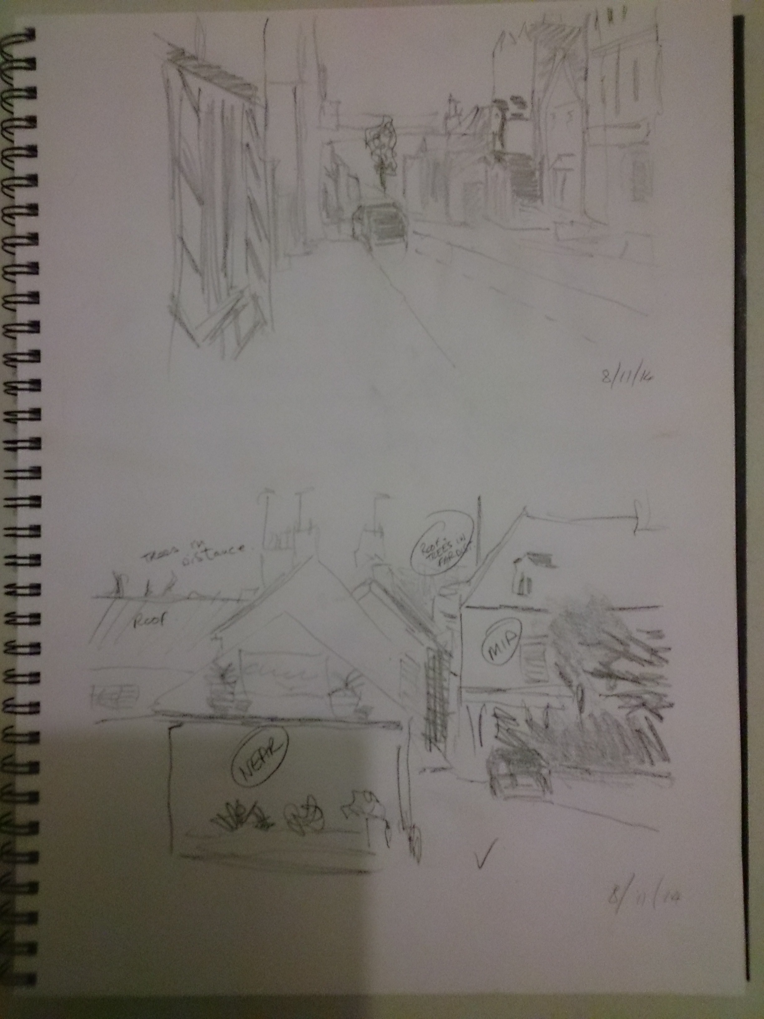
Preliminary sketches of a trip to St Asaph (smallest city in Britain)
Final Drawing
Side street in St. Asaph, the smallest city in Britain.
Reflection on Part 3
Observational Skills – Overall I feel that throughout part 3 I have felt different about seeing things. I have observed more intensely, recording the differences in tonal values and the relationships between light and shade. I have come to the conclusion that if I draw a simple line, I must make one side darker than the other. This gets rid of the line. This is because in reality things are not surrounded by lines, we see things because of light and dark. This realisation has helped me a lot in drawing, not with lines but with tonal value. I also try to see things as if in black and white, either by squinting or using a red perspex filter, in order to take out the colour of things. I find this extremely useful as it helps me see true tonal differences without the confusion of colour.
Technical Skills – I have spent a lot of time looking at other artists way of doing things, mainly with purchased videos or on line, and feel very enthusiastic about my improvement in technical skills. For example, what used to take me 3 days can now be done in a few hours.
Content – I have tried to make all my drawings visually interesting, rather than just exercises. I have engaged with all the subjects in part 3 as I am very much an outdoor type of person, especially with historical subjects. I have tried to express myself as best as I can through drawing what I see and HOW I see it. I try to say to the viewer, “this place interests me, come and see it with me”
Presentation – I am getting to adopt the idea of asking myself the question, “is it good enough for public gaze” before I post it in my journal, after all my journal is public. I simply do not want my work to be exercises for a qualification but rather statements in their own right, to be seen by anyone for enjoyment. This sharing of work gives me the greatest pleasure, so I believe it should always be of the standard suitable for sharing.
Creativity – I dont know how to measure my own creativity, but I try to be creative by experimenting with different materials and techniques. I have produced work in ink and coloured pencil, something that I would never have dreamed of doing a few months ago. Using Pen and pencil to achieve greater tonal variations. As drawing is a new journey for me, I enjoy experimenting with different materials and getting different effects.
what I would do differently – I have taught myself by reading books and researching on the internet, watching videos etc. In a few short months. I think I have probably learnt a lot of rubbish compared to someone who has had the benefit of a college or university training. Therfore I know I must make contact with other artists, but feel nervous about not having had any formal training and might feel a bit foolish compared to them. I think also going to art galleries is something that I will definitely do in the future.

Wauw Jamie; I just love your trees and clouds! Well-done!
Many thanks
I love the sketch walk too. Lovely drawings.
Hi Jamie, your work looks fantastic!! Could you please check whether you can put the ‘follow’ button on your blog? Then it could see immediately whenever you are posting. Now I go via the OCA, coursemates, select drawing etc etc.
Hi Monique, thanks so much for your kind words, as far as know the follow button is on, check the top left. Unfortunately, I have one page per part of the course, and dont enter every exercise as a blog, so I dont know if notifications work in this case ???
You certainly know your perspective! Excellent!
Hello! Apologies for bothering you, but I wanted to let you know that there’s a girl on Twitter that’s stolen on of your pieces and has claimed it as her own. The piece is exercise 2 – sketchbook walk. Her Twitter is @bessieswinton and here’s the link to your stolen work on her page https://twitter.com/bessieswinton/status/593077913437732865