This is the diary of my final assignment for drawing 1. I am starting it without knowing what my final drawing will be, so I am treating this assignment as a journey as it unfolds as I experiment along the way. I will right down my thought processes as i proceed. Hopefully I will arrive at something worth saying and looking at, as well as a title for my project.
During this course I have enjoyed part 4 the most “The Figure and the Face”. So “The Person” will be my starting point for my journey, and see where that takes me. So I will start by drawing a man.

I used a photo reference from artists model poses for this study. As i live in a very small community, i do not have access to nude models, so it proved to be a big help with an immediate start.
I will draw a few people, not any particular scene or activity, just people.

I like my idea of just abstractly placing people around the page. I will explore this idea later.
My Tutor told me to draw lots of hands, so i have been practicing plenty so i will focus on some hands. I will start with a detailed study of one hand from Michelangelo’s David. And one of my nephew’s hand with his mobile phone, one classic and one modern.

I wish i could have gone to italy to draw from the real David’s statue, however, this was not possible. I enjoyed studying the detail and modelling the form in these two studies.
Whilst Michelangelo is in my mind, i will study other parts of his David.

I find the human body so beautiful to draw, maybe one day i will draw a larger version on some beautiful paper and hang it on a wall. It feels like i am warming up. Maybe i am getting somehere.
Leonardo da vinci and Michaelangelo comes to my mind when thinking about classical drawing. Looking for something to draw during my research about them was easy

It would be fantastic to stand on some scaffolding 18 feet high to feel and draw David’s face, but i still enjoyed the close up detail of the photo. Not possible any other way.

Drawn from life. I do like sanguine. It is so much warmer than the cold flatness of graphite. His eyes have more life and energy with sanguine.
I will expand on these studies and compare classical and modern day physical portrayals as subjects.

I tried to inject an element of humour here with Dave as the clasical hero, and my husband Laurence as the 21st century anti-hero. I will experiment with some portrait sketches next, and see where that takes me.


A set of six British celebrities. I had to choose very well known faces for these sanguine portraits, as i believe the the general viewing public sometimes judge an artist by how well they can produce a recognisable portrait. I believe this adds legitimacy to an artists abilities and skills. I feel that if i had produced totally unknown faces, then how will my assessors know that i am able to produce a realistic likeness. Hopefully the drawings will speak for themselves. I also believe that an artist must be able to draw well before anything else.
It is also my intention to focus on portraiture in my future artistic career.
These portrait sketches are OF people and not ABOUT people. I want to say something about people and i will return to the occasion when i went to wrexham town centre and did some ink renditions (in part 4) of people rushing about doing their shopping. Some descriptive words come to mind about what i saw. Randomness, anonymity, movement, and colour. These are the feelings or qualities would like to include in what i would like to say about people.
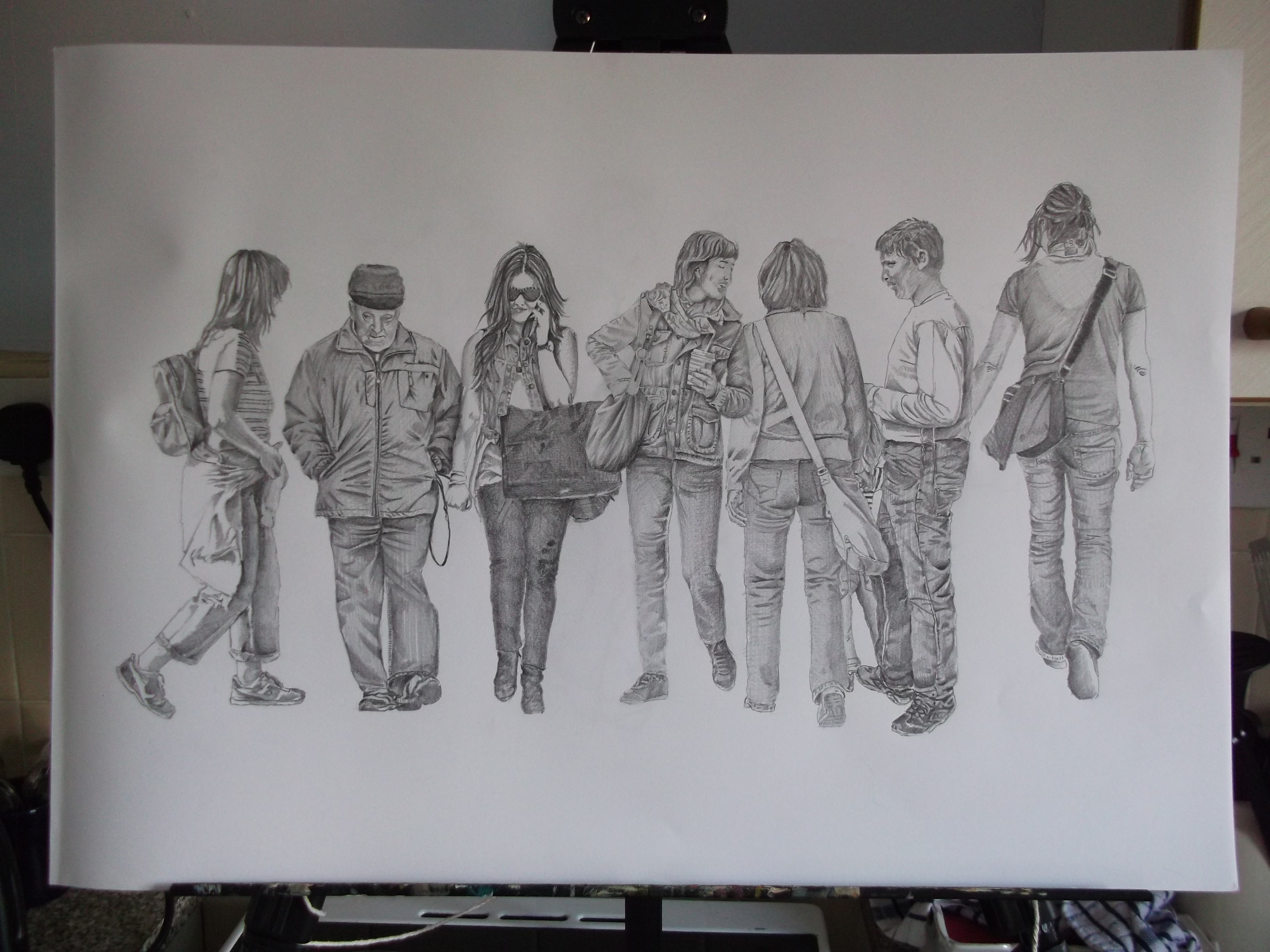
I think i have captured the randomness and possibly movement elements in this fairly detailed sketch. I still need to capture anonymity.

Faceless and anonymous, imaginary subject. The suggestion of the man can be seen in his reflection.

Expanding on the subject of rain, this is an imaginary scene that turned out to be a happy accident. I tried to create a chromatic black with acrylic ink, using blue and raw umber and got a sort of green. So i started adding other colours to compensate. I couldn’t make a chromatic black, but this is what came out.

I chose yupo paper because i used an isograph pen 0.35mm and it was the best surface to allow for very fast non-stop drawing without snagging on the paper.

Not having access to a life model i drew this from a vimeo video of a model in slow constant motion. It is not so much a drawing of the model, but rather a linear dipiction of her motion.


I was more animated with my arm and hand movements in this imaginary sketch. I rotated the pen as i scribbled rough depictions of people walking, in order to have a line of variable thickness. I tried not to lift my pen from the paper. I think this adds to the movent in the sketch. I did not show any detail which adds to the randomness and anonymity of the image, i also added some perspective to give a sense of depth. So i have included, three of the four qualities i set out to include: randomness, anonymity and movement. I need to include colour. I am clear in my mind now about what i will do for my final drawing.
I have used some public domain photographic images as references on purpose. I find that photos give me access not only to varied subject matter not available to me, (as i am a full time carer) but access to greater detail and nuances which i like to portray in some of my drawings.
Final Drawing
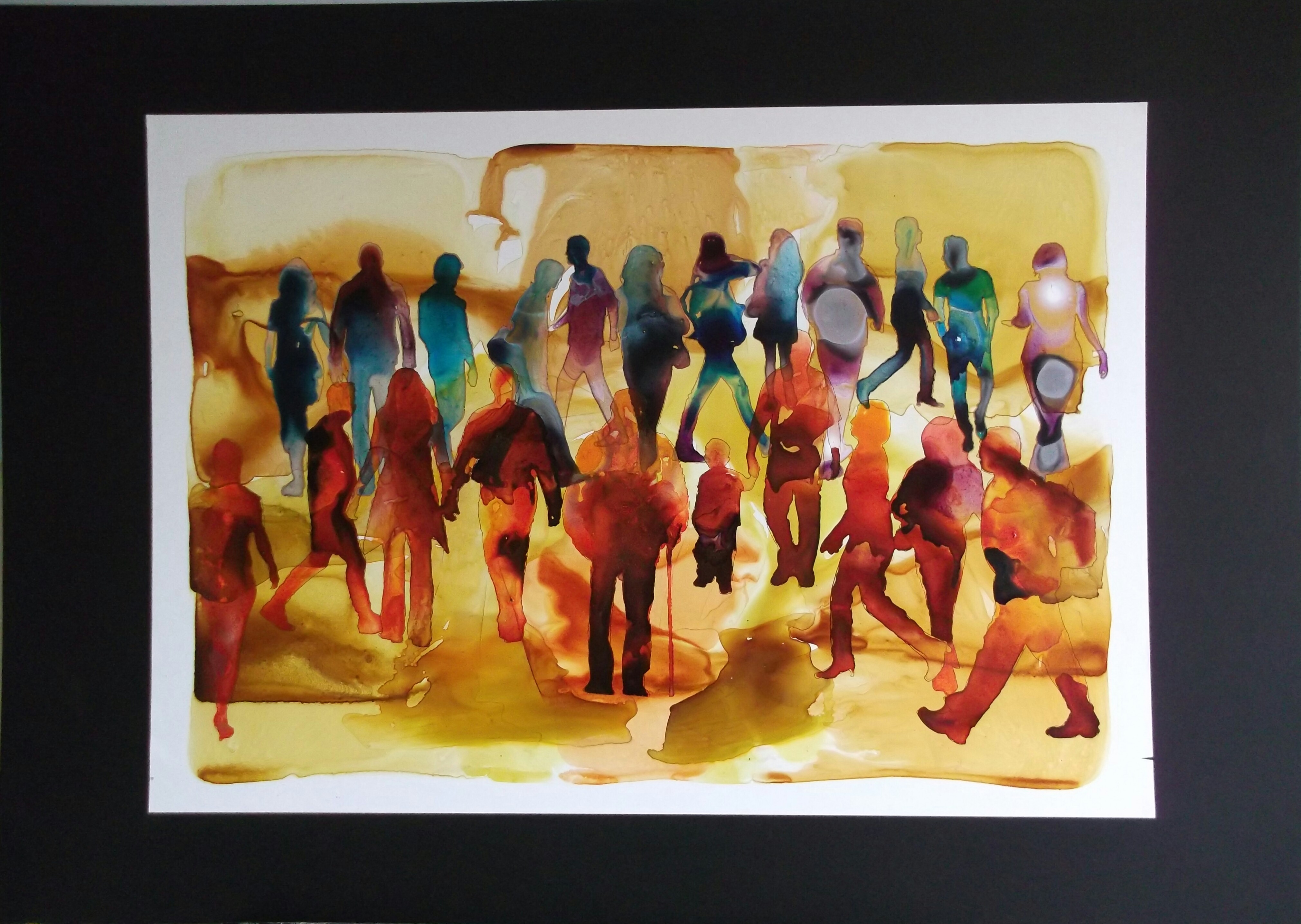
- 10/03/15 – Faceless Crowd – Acrylic ink on yupo 25 x 18 inches. Mounted on A1 black mount board.
Artist’s Statement
“Combining the colourful and unpredictable movement of people with the colourful and unpredictable movement of ink.”
For this assignment i chose the the “Person” as a starting point, as i enjoy drawing them more than any other subject. The human story, is for me the subject that has the most to speak about in terms of art. My final drawing came as a suprise to me, as it is not something i would have thought of without the preliminary work as a journey
I started out without any preconceived ideas of what i wanted to say, and slowly made some some discoveries which lead to my final expressive piece. I came to the realisation during my preliminary drawings that i was drawing people, but i wanted to say something “about” people. I made mental recollections of times spent shopping and observing the crowds of people, and the descriptive words “randomness, anonymity, movement, and colour” came to mind. I made these words the ideas that i wanted to portray about a crowd of people rushing about.
The classical drawings are fairly detailed, but do not say anything very expressive. I decided to loosen up and be more expressive with my mark making, and made a very quick drawing of a crowd using a chisel sharpie pen. I discovered that i had said more about the movement, randomness, and anonymity of a crowd of people with this very quick drawing than all the other detailed lengthy drawings. I also deliberately chose ink as i like the fact that it is not erasable, and once a commitment is made with ink, i had to respond to any mistakes deliberately as well. I kept the pen moving and twisting, totally ignoring detail or accuracy. My focus was on randomness and movement, this very quickly gave me three of my four descriptive elements i wanted to portray.
Thinking about my fourth element “colour” brought me to the idea of using fluid acrylic ink. I wanted as much unpredictable fluidity as possible and so chose a non porous surface Yupo to work on. I layed down random puddles of water and floated earthy coloured inks on top in layers after each layer had dried as a ground. I then outlined random silhouettes of people walking in different directions and used the same technique of floating ink on puddles in cool greyer colours to suggest distance. Then placed the foreground with warmer colours to bring the silhouettes forward.
The uncontrollable and random movement of the floating coloured ink in the silhouettes helped me portray a crowd of people whilst at the same time, expressing all four of my descriptive elements “randomness, anonymity, movement and colour”.
In my final analysis, i discovered that quick, greatly simplified and loose drawings can be more expressive than highly detailed and skillful drawings. From this course i have also learnt that art is not about drawing pretty pictures, but more about self expression. I think i have produced an expressive work using an experimental approach with unpredictable fluid inks, which reflects the nature of the “faceless crowd” i have portrayed.
Reflection
Demonstration of Technical and Visual Skills – i hope i have demonstrated these skills by my use of various materials. I have improved my classical drawing skills greatly during this course, being able to do only very basic line sketches prior to study. I have explored many materials and have enjoyed experimenting with them. I am sure i will discover many more in the future. I have learnt how to be more observant when i go out and seem to be able to see not only simplified shapes, tones, shadows, patterns, textures etc but also try to observe the unseen. The character or quality of the subject. Mood, age, style etc. I try to capture these elements by making various sketches and simplifying my observations into pleasing compositions, before commiting to a final drawing. On the other hand, if i see something that really grabs my attention i like to draw it spontaneously in order to capture the essence of the moment.
Quality of Outcome – i hope i have demonstrated “conceptualisation of thought” by providing a commentary with my sketches throughout my learning log of my thought processes. These processes have helped me produce a pleasing a content relative to my experience / inexperience.
Demonstration of Creativity – As my final drawing was purely experimental and completed from my imagination, coupled with a very clear set of four descriptive elements i think i achieved what i set out to do, in a personal way, which, i hope demonstrates creativity.
Context – when i first started this course, i couldnt see the point of reflecting on one’s work, and felt awkward doing it. But i now look forward to it at the end of each project as it allows me to see my journey and learning clearly as well as help me plan my future journeys and learning. It helps me correct my mistakes, which i would be unaware of had i not reflected on my work. It helps me think and feeds my imagination which can only make me more creative. It reasures and encourages me, which pushes me onwards on my learning journey.
