Exercise 1 – Drawing Fabric using Line and Tone
page 124

A heavy coat thrown over chair. I found this exercise a challenge, it forces you to look very intensely for open and closed abstract shapes. The lighting was bad so that in itself has taught me a lot. I will rework this exercise with looser fabric and better lighting, in order to compare.

I decided to close the curtain and shine a bright reading lamp with a daylight bulb in it. Much better for identifying shadows. My first attempts was with the daylight from the window and light from the overhead lighting, so I was getting two sources of light, which made it difdifficult to identify shadows properly. A single source of light from a lamp made it so much easier to identify shadow shapes.
I also found it easier to think in terms of drawing shadows shapes rather than trying to draw the article. Thinking this way of abstract shapes, the fabric seems to draw itself.
Exercise 2 – Emphasising form with cloth.
page 125


I tried 3 different fabrics for this exercise and drew three different effects. The thin cotton fabric defined the body shape more. If I were to do this exercise again I would spend more time setting the pose, choosing the correct fabric and setting up a single light source. I think these are big factors that I should have taken into account…..alas, hind sight is a wonderful thing. Nevertheless, I feel these exercises have taught me a lot about observing open and closed abstract shapes, and not relying so much on lines. I feel I am not such a slave to the line. (aah aah moment).
Research Point
Page 127
How the Depiction of male and female nude has changed over the centuries
1) My first source for research was the recommended BBC series by John Berger “Ways of seeing” episode 2. Which, has to be said, focuses solely on female nudes in western art. He emphasizes this by saying, ” woman were, and are, the principal subject of the nude in western art”. My own opinion of this documentary, is that it was very one sided, from the male perspective, in that it was all about nude women painted by clothed men. I do not know enough about art yet to be able to say whether or not this is an acurate depiction of the nude in western art.
Not a lot of different historical depicictions of nudes in art were delved into, except the biblical reference to Adam and Eve being used to illustrate that nakedness is in the eyes of the beholder, and that women are subservient to men. Man being the agent of God.
He then goes on to say that nude women in art is for the pleasure of the male spectator. I concur with this view, as I don’t think that most women depicted in nude art reflect any kind of reality, in so far as they don’t portray any kind of emotional or individual expression, but are instead portrayed as men would like them to be ie; naked, beautiful, vulnerable, submissive, available etc…for example, King Charles 2nd commissioned a painting of one of his mistresses, Nell Gwynn, and is seen as her submission to his demands.
In most instances of western art, the female nude is seen gazing at the spectator, depicted as inactive, languid and available, in order to feed the male appetite. Overall, John Berger seems to say that in western art, men see women as they want to see them, not as women see themselves. This is echoed in the interview with several women in the studio, where they sum up by saying women don’t see female nudes in art as real, they are exaggerated and idealized etc etc.
My next source was; The Nude, a New Perspective by Gill Saunders ISBN 0-906969 980
My thoughts about John Bergers documentary seemed to have been confirmed when she said “There can be no doubt that the female body is used excessively and indiscriminately in our visual culture”. She adds “Nude is synonymous with female nude” because nakedness connotes passivity, vulnerability; it is powerless and annonymous.
Historically, attitudes towards the naked body has changed. The Greeks saw the nude as a celebration of physical beauty, which depicted the nobility and potential of the human spirit. On the other hand, to Christians, nakedness became a symbol of shame and guilt; the Adam and Eve story for example. In this Christian art of the gothic period (12th – 16th century) the naked figure was seen as an outward sign of sins of the flesh.
By contrast, the renaissance nude reverted to classical ideals. Nobility and potential for perfection were embodied in the naked figure. Leonardo’s Vitruvian man attempts to prove that the male body was the pattern for perfect geometric shapes, the circle and the square. The Nude was used to depict ideal concepts such as, truth (Bottichelli) or sacred love (Titian).
The Nude as a subject of art, in all ages has remained constant. Objections to nude art are rare, except for the character or presentation of nudity attracting criticism. Presently, the female nude is generally regarded as acceptable, whereas, the male nude can still provoke censorship.
The male nude model however, has been the main subject of art training from the 15th century, almost to the present day. The reasoning behind this was that the male represented physical perfection, and that women were physically and morally inferior. Strangely, female nudes in painting and sculpture, were derived from male models. Consequently, they appeared unconvincingly, either muscular, as Michelangelo’s figures of “Night and Dawn” or the androgynous “Venus” by Parentino.
The ancient Greeks portrayed the male as active and creative in politics, business and culture. Women on the other hand, were portrayed as passive, staying at home. Society has, and does serve to create and identify stereotypes, images of nude art, advertising and other media for example. Durer’s “Draughtsman drawing a nude” presents the female model as passive and material for the male artist’s creative intelligence. The male artist is portrayed as active and analytical.
The “Medici Venus” portrays modesty, her arms trying to conceal herself, but in fact, her gesture emphasizes rather than conceal her sex. Most images of naked women by men are designed to display their bodies for the male gaze without challenge, an object of desire, a focus of male sexuality. Sometimes the female nude is sleeping, or her gaze is averted, or her eyes are hidden or turned away from the viewer so that her face is not seen. Sometimes the face may be covered or unfinished, all of which render the subject annonymous, without identity or status, thus rendering her body to a stereotype. An exception to this is Manet’s “Olympian” which was objected to because she was depicted as unashamedly aware of the spectator’s desire. Criticts interpreted this as imodest. Dega’s nudes departed from this tradition, eg; his pastels of women washing and drying themselves. Degas himself, describes them as a “human creature preoccupied with herself.”
On the other hand, male nudes, constructed by male artists, are portrayed as active or dynamic, shown as fighting, labouring or gesturing, emphasizing his muscles, portraying excellence and physical perfection. It is not portrayed as a sexual object in contrast to the way the female nude invariably is. Softness, curves, smoothness are celebrations of the womans body, whereas, strength and muscular development are the prerequisites of the male.
Sources of the naked male body have been produced for a limited audience such as, medical and anthropological studies, body building magazines and images for the gay community. However, they remain relatively rare in mainstream culture.
Occasionaly, the passive male nude is portrayed in classical art. The central image of the Christian religion is a tortured male nude, a feminized man, who passively accepts humiliation, punishment and death. Christianity portrayed the nude as an ideograph of spiritual suffering.
The active female nude is only occasionally portrayed as the embodiment, the allegorical personification of purely male qualities or attributes, such as in revolution, victory, virtue, justice etc. Sometimes predatory female nudes are shown as the dangerous “otherness” of women’s sexuality.
Project 2 – Proportion
Exercise 1 – Quick Studies
Page 130


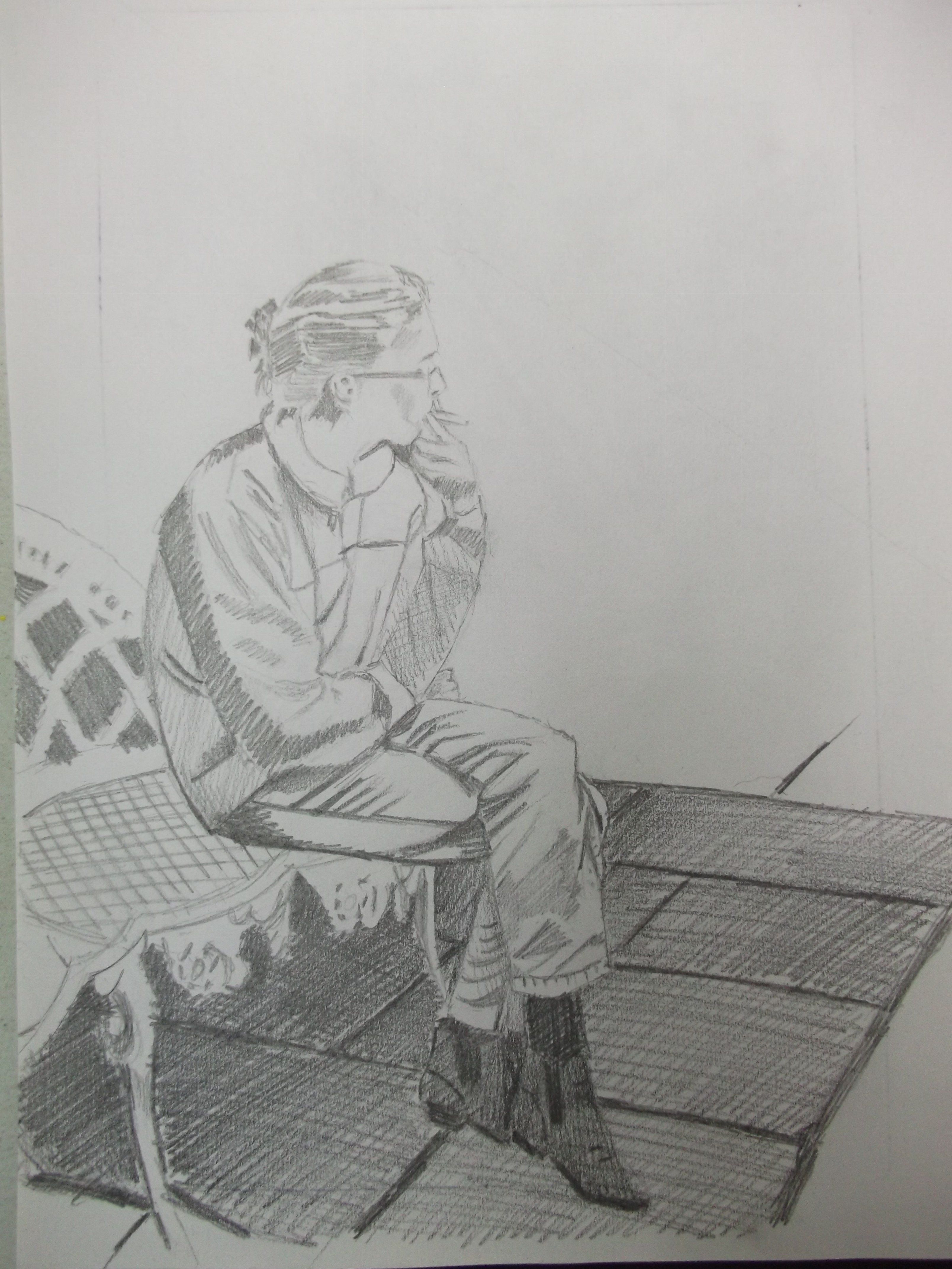


I find shapes and proportions are very naturally easy, however, my problem is trying to overcome the lighting problems in natural settings. Eg the two drawings of my sister having her cigarette in deep thought was drawn on a very cloudy day, so there were no natural shadows, or hardy any, and the drawing of my husband in the reading room was overhead househould lighting. I decided to introduce some artificial light when I drew my husband sitting cross legged, with a reading lamp fitted with a daylight bulb. I found this so much better, identifying shadow shapes, which made describing his form so much easier. I think in future, I should draw from aquired knowledge and introduce shadow when there is none, or introduce a single source of light where practical, ie in a more formal studio setting.
Exercise 2 – A Longer Study
Page 132

I am very happy with with the mood of the drawing as it is very characteristic of the sitter Anne. One of the elderly residents in the nearby community centre, attending the weekly knitting club.
I think I could have used darker shadows to add weight and ground her, however, her clothing was very dark and I was trying to lighten it a bit, so given the lighting and dark subject I am happy with the weight and presence.
I used a proportional divider when drawing, so I am confident that my proportions are correct.
Research Point – Foreshortening

Project 3 Form
Exercise 1 Basic Shapes
Page 133

I didn’t quite understand the question, wether I am required to show form with simple shapes (which is a contradiction of terms) or show simple forms such as cylinders, spheres etc. To describe the human figure, so I drew some simple shapes to give a basic description of the figure, then developed it into simple forms.
Exercise 3 – Stance
Page 135


Exercise 4 – Energy
Page 137

I enjoyed drawing on this A2 size paper as I could use my whole arm to make long strokes and marks, which helped me describe movement and a bit of energy, even though my model was in a still pose. I think it is better to stand, with paper on an easel rather than sit down and sketch this subject, as the energy of the drawer is also reflected in the finished image.
Project 4 – Structure
Exercise 1 – The Structure of the Human Body
Page 138

3) female hand. 4) hand showing 3 pads on each finger. 5) protruding wrist bone. 6) hand showing expression. 7) elderly missshapen hands


Proportions – The classical Greek and Renaissance figure was an eight-heads-length figure. However, the average figure height is between seven and eight heads.

Certain bones project on the surface of the body, which can act as important landmarks for the artist. On a person with thin skin, they protrude, but on a person with plump skin, the show as dimples, as in (1) and (2)
To my mind, these proportions and landmarks are only useful to the artist as points of reference and measurement if the subject is naked and standing in a vetruvian man stance. The moment the subject sits or bends or covers the skin, they are lost. For example, if for effect the artist wants to draw a person lying down viewed from the feet, then the feet will appear much larger than the head, due to foreshortening perspective.
Exercise 2 – Three Figure Drawings
Page 139 & 140


I enjoyed drawing from life best as I could sense the mood and life of my sitter, as well as the form and weight. Drawing from books is not the ideal, but it served its purpose as there was a shortage of live models volunteering to pose nude, and as I was getting nowhere for days hoping for a sitter, so as a last resort I used purchased royalty free images. This is where a knowledge of the human sketelon and muscle structure was really useful, especial for the females ribcage and the males arm muscles.
Project 5 – The Moving Figure
I looked at “New Balance Sneakers vs KFC Bucket” by David Haines, wow!!! I am very impressed with his style and attention to detail. If I were going to be a professional drawing artist, then that is the way I would want to draw mostly. Richard Hambleton’s “Osaka” is also fantastic, he captures the movement in a totally different way and i’ m sure in a lot less time, but equally successful.
Exercise 1 – Single Moving Figure
Page 143
Some examples of my sketchbook drawings

The top two drawings were from my kitchen window looking on to the street. A fleeting chance to record the shape of movement passing by in a few seconds, the rough scribbled and undefined lines drawn at speed capture the energy of the passers by I think. In comparison to the young jogger, the little old lady pushing her shopping trolly shows a lot less energy, due to a slower drawing speed and more defined edges. The little girls feet are zig- zagged to show movement. The dog walker and little boy throwing a ball have ghost images to show movement.
Exercise 2 – Groups of figures
Page 143

No detail shown at all here, just a few bold and rough uncontrolled Pen marks, to suggest the activity of walking in town doing shopping. Some movement being shown by the postures of the figures, but movement is also created by the composition. I drew the two figures on the right, leaving the scene, ( usually a bad thing) in this instance the eyes are drawn out of the scene but soon flick back again, im not quite sure why, probably because of the potential interest or curiosity (due to the lack of detail), inviting the viewer back in. I drew drew this mostly blind, just eager to record blocks and shapes to suggest walking gestures.
Project 6 The Face
Warm up – just for fun page 144

I love doing portraits, especially in sanguine, I don’t need to think about complicated colours or composition too much, a simple pose with eyes at one third in this drawing. This took about an hour and a half to draw, and I have discovered a very good way to fix the pastel/chalk. (Tip) I use a 50/50 mix of acrylic UV Matt varnish and water applied in very fine coats with an airbrush. I spray the back also with a couple of coats to avoid warping, dryed with a hairdryer between coats, the process can be done in a few minutes. I usually apply four coats, with no colour change or darkening or damage to the surface. (hope my tutor approves?)
Exercise 1 Facial Features
Page 145
eyes

I really enjoyed this exercise, I found the challenge of trying to show approximage age in the studies very rewarding. I love the intricacies of the older eye, with its darker shadows and heavier lines, the looseness of the skin and that “lived in” appearance. The baby’s eye was the quickest to describe, as there are no character creases or lines to show age. So for me, I enjoyed the challenge of the older eyes more.
noses

Mouths

Ears

I feel I have improved my drawing skills many times over with this exercise. It really heightened my appreciation and understanding of form as well as improving my technique. (thanks to my tutor: Michelle Charles) I especially like her suggestions about not smudging. As can be seen in these exercises I have used bolder lines and shading, with no smudging. When I now look back to my first drawing attempts in earlier assignments, the drawings with smudging look so amateurish, but now I like the more mature looking bold lines and shading, they are more deliberate and more enjoyable to draw, thanks Michelle!
Entire Face

Research Point
Page 146
Met Museum quote; “The depiction of the head becomes a true test of the quality of the artist and a telling indication of style”.
As ancient Egyptian art was two dimentional, heads were usually depicted in profile view as it is easier to show the nose correctly without using shadow, which the Egyptians never used. However, they depicted the eye from a frontal view in order to show the iris and pupil.

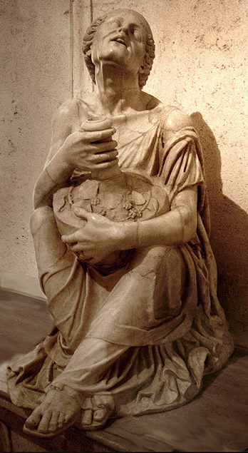
Helenistic sculpture was hyper-realistic, where the expression of the face provokes an emotional response. This intoxicated woman’s face is full of emotion, she seems to be calling out. she is old, deep wrinkles line her face, her eyes are sunken and her bones stick out through her skin.
Rembrandt’s late religious portraits (17th century) are dramatic depictions of apostles and evangelists. The subjects in theses powerful images peer out from dimly lit interiors, burdened by the weight of their spiritual and emotional concerns. He was a master of chiaroscuro ( light and dark), drawing attention to the face by applying dark backgrounds. He was restrained in his use of a limited palette, exactly The opposite when it came to applying the paint in an impasto style.

Vincent Van Gogh did not try to imitate the sitters physical forms, but rather conveyed the ideas behind people. He did this by emphasizing certain colours, using vigorous brushstrokes and paying attention to highlighting. His focus on colour and brushstrokes demonstrated their inner qualities and his own relationship with them.

HenrI Matisse’s (one of the Fauves – the wild beasts) paintings were characterized by wild brushstrokes and strident colours. They had a high degree of simplification and abstraction.

Chuck Close (1940) is an American artist who achieved fame as a photorealist through his massive-scale-portraits. He is known for using intricate patterns to portray a human portrait.

Large scale portrait-come-landscaping project by the American artist Jorge Rodriquez-Gerada. This takes up six acres of land and he draws with 800 tons of dark potting soil and a lighter 2,000 tons of sand. It was commissioned by the Smithsonian’s National Portrait Gallery

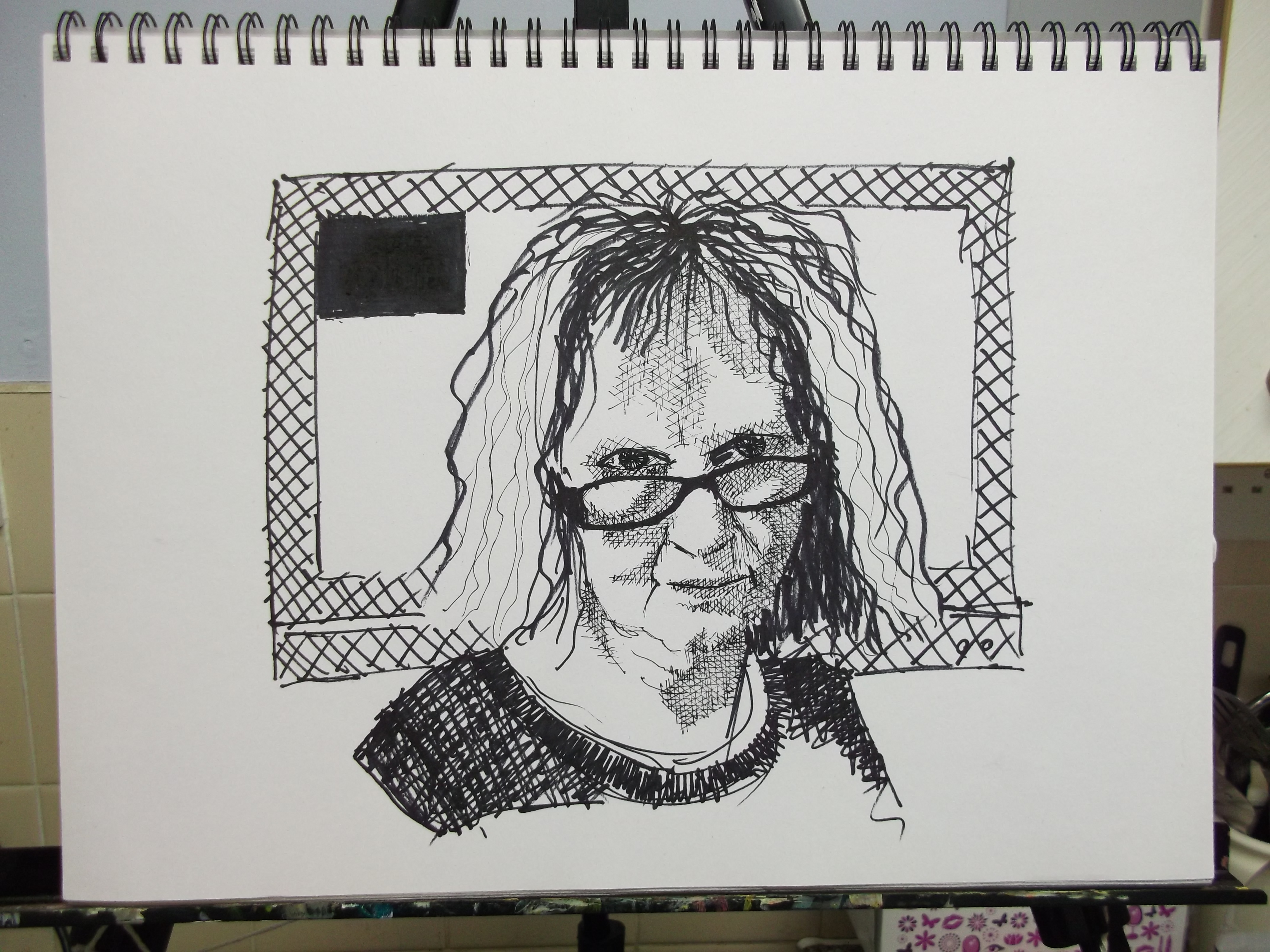
Exercise 2 – Your Own Face
Page 147


Reflection
My own preference in drawing materials for this exercise was Conte Sanguine. I feel it helped me produce a realistic image not only as a likeness but I also managed to show my seriousness and concentration in the drawing. I like its versatility in being able to show light and transparent shadows to heavy opaque blocks of tone. This helped me to show some nuances in depth and some movement into my drawing. If I compare it to the black and white ink drawing it has more life in it. I tried to show some movement in my ink drawing by the speed, looseness and carelessness of my pen strokes, but I still feel that my sanguine drawing has more guts to it.
My portraits do look like me, when I look in the mirror. I posted them to Facebook and friends and family have commented about how very realistic they are, and how they capture my nature.
It was easy to draw my portraits, I find it easy to see the whole image, rather than break it up into bits of ears and noses etc. I try to forget that they are ears and noses and try to see shapes of light and dark instead, and lines of straightness or curves. Whilst drawing, I might think to myself, “theres a dark banana shape here, or a squiggley snake line there etc.” once I have got the main landmarks in I then try to model the forms by adjusting the lights and darks and adding variations. So I did not find it difficult to transition from sketches to full portrait.
Research Point – Artist’s Self Portraits
Rembrandt van Ryjn – Rembrandt’s approximately 90 portraits create an autobiography in art. This painting has a look of being unfinished, some areas, such as the face and right side of his hat have a grey layer of paint that he uses as a tonal middle ground, on top of which, bold lights and rich dark accents have been added, sometimes with rapid strokes of paint applied wet into wet. He sometimes drew into the paint whilst it was still wet. This portrait was painted with many nuanced colours, thick paint which imparts a dynamic realism. The impasted areas are in contrast to the subtle glazes in the eye sockets.

Vincent Van Gogh – this portrait was done at the asylum where van Gogh had been committed following a mental breakdown. The fervour and fragility of his life can be seen on this canvas as told by stark contrasts of colour and restless brushstrokes, energetic and heavy lines of paint can be seen swirling around his head. This background sets off the complimentary colours of his green tinged face and orange hair, raising the image to a higher pitch. If one looks closely at his face, greens, blues and violets are mixed optically to produce a realistic image.

Exercise 3 – Portrait From Memory or the Imagination
Page 151

oh dear! Not so easy. I thought I would draw someone famous so that others can judge to see if my drawing from memory produces a realistic image —- mmmm not really. I stuck a picture of Elvis on the wall for a few days and looked at it often, I practiced or imagined drawing his face in the air, trying to get some sort of feel for muscle memory. I think his hairstyle is his most memorable identifier, which gives the viewer a clue to who it is, I think the brain fills in the rest of the detail. I think its a very good exercise to try often as it forces you to look and see very closely.
Assignment 4
Page 152
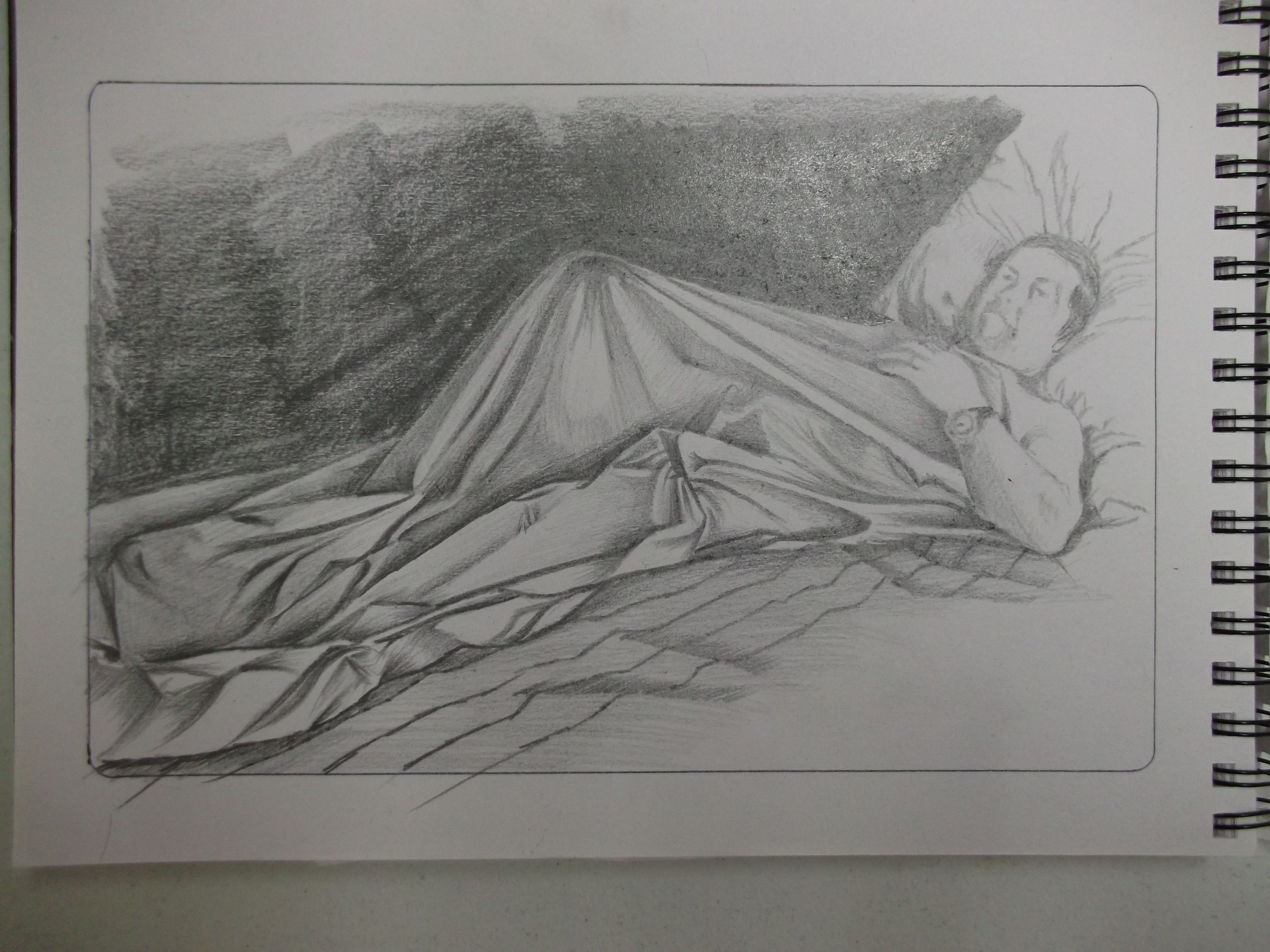
1) Figure Study Using Line (A1) – Seated Model in an upright Chair

2) Figure Study Using Tone (A1) – Reclining Model

3) A Portrait or self portrait combining line and tone (any size)

These drawings were drawn from life with photo reminder.
Reflection
I feel I have aquired the necessary skills and techniques to draw simple human figures and faces. I feel I have aquired a level of visual awareness to accurately describe the human form on a two dimensional surface, using traditional drawing materials ie: ink, graphite pencils, pastels, chalk and charcoal etc., and then to place my chosen subject in a compositionaly pleasing manor onto a drawing surface.
I hope I have presented my work in a professional and coherent way, using my limited knowledge, but I don’t think I am qualified to assess the quality of my own work yet. But I have tried to submit work that I am not embarrassed to show. During this course I have learnt that drawing every day can help with the thought processes and conceptualizing ideas. I have learnt that drawing for the artist is not just about putting pencil to paper, but about concepts, ideas, thought processes etc., not as a means to an end, but as a means to a starting process for self expression.
All my drawings have started out as experiments, without expecting too much. I find that if I just draw what I see, then one thing leads to another, a change here and there, a different drawing material, a different angle, take a risk with bolder strokes etc, soon starts my creative juices flowing. I think the more fluent I become with the materials at my disposal the easier it is becoming to say something with them, for example, I try to say something about the people in my portraits by capturing and showing the expressions on their faces.
Doing this Drawing 1 course has helped me realize that it is not simply enough to pick up a pencil and be a practical artist, but that critical thinking and reflection helps develop the artistic mind and in turn the artistic voice. I don’t regard this course as a means to an end, but rather as a means of starting to discover a part of me that will allow me to speak my thoughts and ideas through the medium of art.

Hello Jamie. I am on part 4 of the drawing 1 course at oca currently. I came across your work when searching for a figure drawn in line on google. Incredibly impressed with your line drawing for the assignment here. which course are you doing now? Or have you finished the degree?
Hi Susan,thanks for your comment on my drawing blog. I have finished the drawing part now and am on my final unit for the painting module. I had a look at your blog and think your work is awesome too. Hope you are enjoying the course. Best regards jamie.