Exercise – Warm-up – Temporary Drawings.
Page 17
Reflecting on tempory drawings.- like an orchestral conductor draI finding in the air describing the emotions of the unfolding music, small gentle gestures for quiet soothing melodies, large sweeping arms drawing loud heroic anthems. So natural, just like a child drawing in the air with a sparkler. Imagine if there was a pencil on the end of an orchestral conductor’s baton, what would the image be like.
I can remember as a child drawing squares on the pavement, and playing hop-scotch. Going back to that spot today, where the corner shop used to be, brings back fond memories even though the chalk marks are no longer there, I can still remember drawing them as if it were yesterday.
It was fun to write in the sand on the beach, perhaps “I love you” to a boy friend or girl friend for all the world to see, just until the next wave that is. So many other people must have done the same thing on the same beach.
Project 1 Feeling and Expression
Excercise – Expressive Lines and Marks
Page 19
During the excercise I found that the more I let go and drew childlike, my lines and marks became more expressive and enjoyable, added to this, I made marks with unconventional tools: an egg lifter, a sponge, a matchstick, twigs, a strand of paper dragged through ink etc. With these tools my marks became more interesting and irregular thus adding energy an movement.

Looking back over the images the following day, I could remember how I felt when I created them. I think its a good idea to repeat this exercise from time to time, just to warm up, play around, experiment with different strokes and mediums. I think that this experimental playing is the most effective way of learning new skills.
The following sketchbook drawing in ink was done yesterday as an experiment with ink, sharpened matchstick and a bit of torn sponge. We went for a walk up to denbigh castle and it is the old weatherbeaten door to st. Hilary’s tower. Just as in the previous exercise, I couldn’t wait to get home and play around in my sketch book. It too was play. Splodging the ink on with the sponge was great.
Although I was not asked to do this exercise, I included it to show that I like to play around at drawing things, just for fun.

Art as a form of human expression
Page 20
Visual art is the most powerful and basic forms of human expression. (according to me). Older than music and poetry man has always loved to express himself visually eg., body adornment, cave paintings, impressive decorative buildings and fashion etc. He has created art with what tools and mediums are available at the time, whether it is finger painting with mud or artists quality acrylic paints and inks. It is the most natural form of expression, and can be a visual record of human observation and emotion. It seems to me that often times, the simpler the tools and mediums are, the more expressive and dynamic artwork can be. It is the uninhibited creative seed that sparks off the initial artistic idea regardless of mediums.
When we view art, we make unconscious associations with personal memories and feelings, just as music can make us cry or dance with joy. When we draw what we feel, regardless of the subject, the drawing acts as a conduit between the artist and the viewer, and the viewer can experience something of our mood at the time of our drawing. Drawing a flower when you are happy will create a mood very different from drawing the same flower when you are sad (same subject, different mood).
Maybe its the weight of the pencil marks, the smooth blending or rough blending, jabbing marks etc that give a drawing character or mood, but I think trying too hard to create a particular mood in a drawing can create a fake looking drawing. I think the best way is just to simply draw what you feel, and the viewer will detect what sort of mood you were in.
Just look at any infant childs drawing done at school, and you will see what sort of day they had at school.
Project 2 – Basic Shapes and Fundamental Form
Page 21
Preliminary sketch book drawings showing the difference between shape and form.

Exercise 1 – Groups of Objects
Drawing 1
Page 22

Toolbox items. I thought the magnifying glass would add a touch of interest. Drawn with an HB pencil.
Drawing 2
Page 23 (and 27)

This drawing started as nothing more than a technical exercise, but then I felt I wanted to describe the hard, cold and reflective nature of the stainless steel and black glass hot plate. The drawing is tight and hard, to reflect the hardness of the objects. I toned the paper with charcoal and rubbed it in to give a mid value, then drew the objects and used a kneadable eraser to show the highlights. The light source is above me as I stood in the centre of my small square kitchen. I don’t think I could have described these objects with loose pencil marks, but maybe I’ll try???
Exercise 2 Observing Shadow using blocks of tone.
Page 24

Preliminary drawing of a butternut, banana and small candle. Its the first time I have used charcoal so It is an experiment for me. Looking at this image the next day I don’t see enough reflected light. This makes the objects look flat, I could rework the drawing and add some lighter values near the base of the objects which would create a more rounded 3D effect. But I think also there is too much space between the objects, which gives a weak structure. I will make another drawing to show more tonal values in between objects as well as more reflected light.

This is my second attempt. I removed the candle as I thought that I had two sources of light. In this drawing with conte crayons I tried drawing only shapes in blocks instead of drawing an outline and filling in. The shapes of the shadows formed the edges of the objects instead. I drew on the wrong side of the paper here, I don’t like the effect, so I will try another drawing.

Third sketch, I swapped the objects for harder and more shiney surfaced objects, to catch more reflected light, although they are simple objects I found it a challenge to capture reflected light without paint. Neverthess I enjoyed it very much.
Exercise 3
Page 25

I did not do any preliminary sketches for this exercise as I was new exactly what I wanted to draw. I did this drawing with a uni pin 0.05. I did not sketch an outline first but rather created cross hatched shapes of varying values to describe the objects and show the edges.
Looking back on what I have learned so far about distinguishing between primary light source and secondary reflected light is that it is not always easy to detect various degrees in values by drawing from sight alone, despite looking at, and studying the objects very closely. I find that it is made easier by also drawing from knowlege (knowing where the reflected light should be etc). I think to rely on sight alone would mean that a lot of the finer nuances would be left out of a drawing. In short, I think that drawing from sight and knowledge makes a more complete drawing. Also that good depictions of light sources make it easier for the viewer to interpret the image without the need for outlines around the objects, as lines around images do not exist in reality. Lines can describe the shape but light and shade (tonal values) depict forms within space, thus creating a more realistic and believable image.
Research Point
Page 26
Odilon Redon drew exclusively in charcoal for the first part of his career, in black ( noirs), and so because of the absence of colour, he communicated the atmosphere and mood of his fantasy pieces with tonal value. Having looked at some of his work, especially his noirs and lithographs, they remind me of some of the spooky ghost stories I have read in my life. Because of this atmospheric potential of tone, script writers sometimes draw thumbnail sketches to communicate the atmosphere or mood of a scene to the director. Dark eerie shadows for a spooky scene, or glints of brilliant highlights on water in a summer scene etc etc.
I think tone has a huge potential for creating atmosphere perhaps more so than colour, just as in the case of odilon redon’s “NOIRS”.
Exercise 4 – Shadow and Reflected Light
Page 27
Preliminary sketches for this exercise.


Drawing showing shadows and reflections. Not only was I getting the light from the window on my left, but also reflections from the white door frame and fridge to my right and behind. I think I have captured a natural image only using soft willow charcoal.
Alternative drawing in ink

I did this drawing in ink last night, I did it only in black ink at first, but just before bedtime I couldn’t resist adding a bit of colour to the backround and tips of the lipsticks. I wouldn’t have been able to sleep if I had just left it monochrome. Nevertheless, I hope I have captured the shadows and reflections in black ink only required in this exercise.
Also see my earlier drawing no 2 for page 23. (no colour)
Page 28
Whilst looking at some of Giorgio morandi’s still life works, I couldn’t help notice how dark some of the negative spaces were between objects and lighter in the upper negative spaces. This gives the effect of almost being able to reach behind the objects.
Project 3 – Composition
Research Point – Still Life
Page 29
The genre of still life is just as alive today as it was in the sixteenth century. The Dutch masters seemed big on symbolism, their subject matter included skulls and flowers, symbolizing the nearness of death and wealth etc.
Then in the nineteenth century artists like Cezanne started to inquire into the subject matter and interpreted it more abstractly. I noted his use of dark tones, especially in the negative spaces which gives more emphasis and glowing prominence to the subject matter. He placed coins or blocks under objects, in order to slant them at the angles he wanted. He Painted vertical objects with an unstable axis, giving a dynamic appearance. He tilted pottery and disjointed perspective ( frontal and left above view). He inclined to emphasize structure and distort form to expressive effect. He created multiple viewpoints in his still lifes. All these techniques created powerful interest, and pushed his work towards abstraction.
The cubists (my favorites) were even more analytical and depicted subject matter from many angles. To my mind, the abstraction seemed more important than perspective, or realistic colours etc. They seemed to break all the rules.
Contemporary artists today are working with iconic personalities and brands in their still life, and many try to get political or other messages across to the viewer through their artwork.
Research Point
Positive and negative spaces
Page 31 & 32
From my own point of view, since researching negative space, I realise how unobservant I am. If I paint a portrait, I will use a mottled background, which can emphasise the subjects face, but doesn’t say anything about the subject’s environment. I realise that my portraits could be so much more interesting if I considered the negative space around my subject. Sometimes I will do the same for a pair of dancers for example, simply because I have not thought enough about the negative spaces around them.
In my opinion, many artists in the past have tended to see negative spaces as secondary to the main subject, or positive space. But it seems to me, that some artists today see negative spaces as equal to positive spaces. For example, Patrick Caulfield uses positive and negative space to describe his black & white flowers:, here, he does not use tonal values to describe the forms of the flowers, but instead uses positive and negative spaces to describe the shapes, and thereby let’s the viewer interpret these positive and negative spaces into flower forms.
Here in his Lung Ch’uan Ware and Window we see that he has concentrated on the negative spaces around the object to create the positive images.
Gary Hume depicts everyday subjects and uses high gloss household paint on aluminium sheet panels, their forms and colours are simplified with subjects reduced to just two or three colours.
In some of his paintings, his positive shapes are depicted only by his use of negative space, eg: Vicious 1994. Here, he focuses on the negative space and the positive space is revealed by allowing the viewer to imagine the male figure.
Exercise 1 Compositional sketches of man made objects
Preliminary sketches

I wanted to choose all white objects without any patterns, so that I couldn’t use colour or pattern to describe the objects form in any way. I chose an L shape composition.

I placed coins under the objects to destabilize the vertical positioning of objects, to avoid a static image, and angled the bowl and jug to peer inside them. I used sanguine pencil which gives a warm tone, and the shadows look nice and transparent. I like the distorted un-vertical shadow from the tilted candle stick as it produces nice abstract negative spaces. I graduated the shading on the background from light to darker to give a more realistic light fall.
Exercise 2 Compositional studies of natural objects
Page 34
Preliminary sketches


I used graphite pencil on a3 cartridge paper. I found this exercise difficult as I struggled with choice of subject. Looking back on my choices, they were all wrong. I found it too time consuming filling the paper with a small pencil, I should have chosen a better medium such as charcoal or conte for a looser drawing, but I learnt a lot by making these mistakes, hopefully I will make better choices in the future.
Page 35
Is it easier to suggest three dimensions on man-made or natural objects?
Generally I find it easier to suggest 3D with man-made objects, as They have harder, more reflective surfaces, which makes it easier to suggest form. However, in the case of drawing, I find that size can help or hinder my efforts. For example I struggled with my last drawing, but would have found it easier had I drawn it on a smaller scale. I was playing around with a portrait of gandhi the other day on a small scrap of watercolour paper, I found it very easy and quick.

This was only about 6 X 8 inches, so I guess the answer to the question would vary according to the choice of size and medium.
How did you create a sense of solidity in your compositions?
I tried to create a sense of solidity by using shading and reflected light as well as inner contour lines (as in the case of the mushrooms in my last drawing). I think that by showing the shape of reflected light and highlights, it can suggest the curve or straightness of an object.
Did changing the arrangement of your composition make a difference to your approach and the way you created a sense of form?
Yes yes yes. Albeit in a negative way. I was not happy with my last drawing as I have said, I also am aware of the indestinctness of the rear tomato. I think this is because the objects are too close and too much similar tone. If I had put some negative space between them and used a bit more contrast, I would have got a better likeness.
Project 4 – Physical and Visual texture
Exercise 1- experimenting
Page 37
Different surface textures: crumpled fabric, sponge, gravel and cast iron.

Additional doodle textures with pen and pencil

Frottage

Exercise 2 Abstracting
Page 38
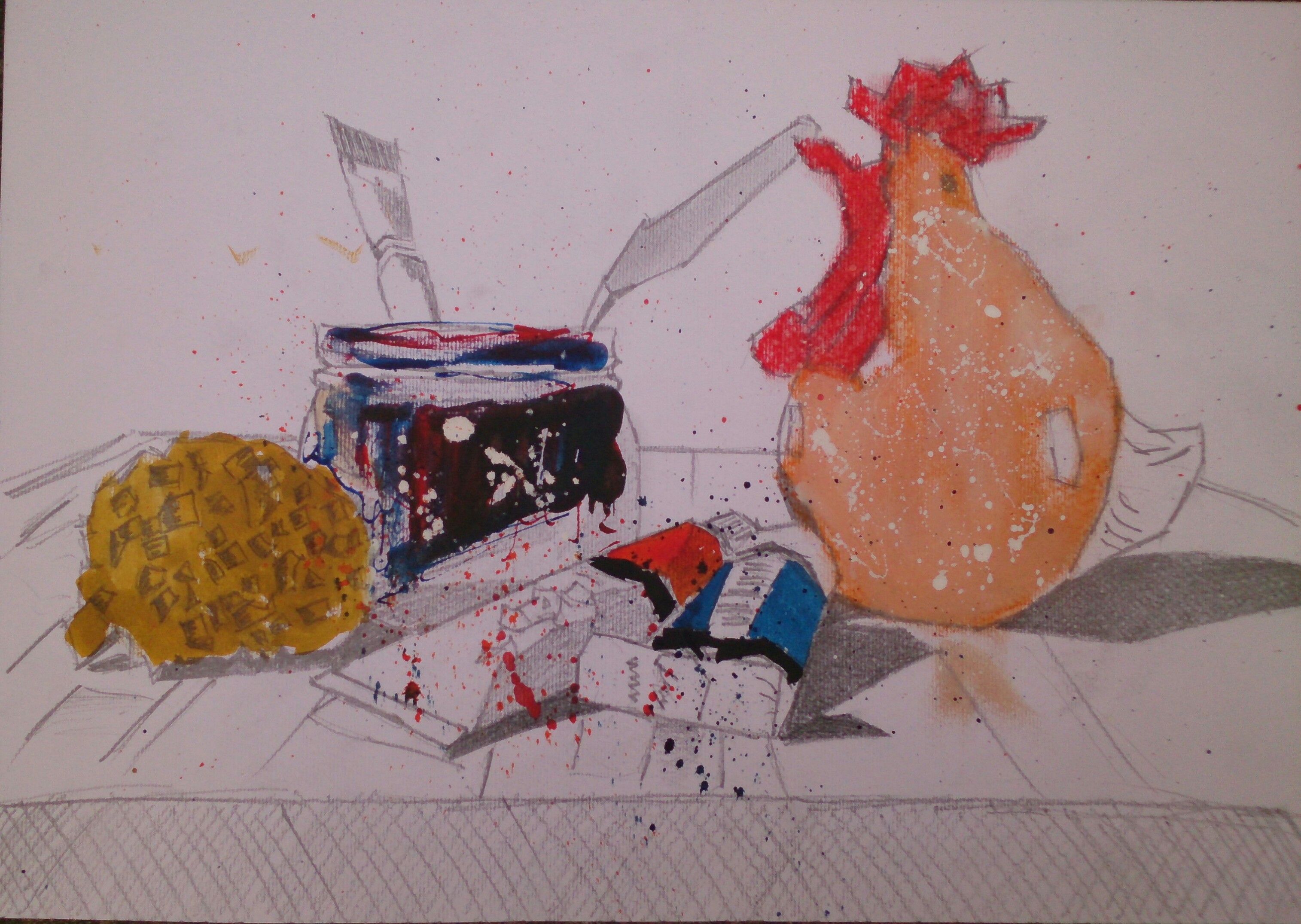
The above drawing was a quick 30 minute abstracting study using some of the ways I have learnt so far to describe surfaces. It is a drawing of some painting tools, materials and a potential subject. I have eliminated all detail and curved lines and used rough and loose pencil marks to describe shapes. A little ink to describe form and shadow. I have used drips and splatters to describe the dirt on the water pot and further splashes to create a feeling of a messy work space. I have left the work unfinished intentionally to evoke a feeling of a work in progress.
Review your work for the last two exercises and make notes on the following:
Have you discovered any new ways of using your drawing tools to depict surface and texture?
I have indeed learnt new ways of using tools to depict surface and texture, some of the being unconventional, such as a six inch nail to make impressions on the page and then shade over them, to reveal white lines etc. A good alternative to masking fluid.
How successful were you at implying form with little or no tonal hatching?
I have learnt lots of alternatives to hatching, such as smooth blending, scribbles and other patterns to depict form.
Just for fun cock a doodle

What are your impressions of frontage as a drawing tecnique?
Great technique, anything goes. I don’t think there are any limits when it comes to technique. It all adds to greater interest in a composition.
Enlarging Images using a grid
Page 39 & 40
Regarding exercises 3 and 4, I have used this method many times and don’t feel the need to do these exercises. I have used perspex grids outside for plein air as well as grids to scale up drawings to large canvases and wall murals. I have read the Oca article on scaling up, tracing and cheating, and my opinion is that it is definitely not cheating. A tracing does not make a drawing, the artist has to add the shading and meaning and colour etc. It is a method of drawing, not a replacement for drawing. I have tried many ways of scaling up images and this process has only made me a better drawer by understanding the reality of what I am actually seeing, instead of what I think I am seeing. I know that repetition is also a good way to learn, and have experienced the repetitive use of the grid method to the extent of being able to draw a scaled up image from memory. Nowadays I prefer to use a proportional divider, instead of using a full grid I simply use a crossbar and relate proportions to that. It’s a matter of of personal preference, I think an artist should use whatever tools and methods are available to assist with their creative processes.
Assignment 1
Initial sketches (first ideas) for each of the proposed drawings

Compositional development work (all on A3 Crawford & Black watercolour paper 300gsm (reverse side)


Mixed media sketch
For my final drawings, I chose the following tools:
HB mechanic pencil – for guidelines
Dip pen – for lines and writing/detail
Sepia and black fine liner pens – for lines and texture work, eg: hairs on the kiwi fruit and wood grain texture on the knife.
Acrylic ink and brush– for large areas, local colour and shading. Transparent effect of glass bottle and shadows.
Ruler- for grid texture on radio
Sharpie felt tip pen– large text.
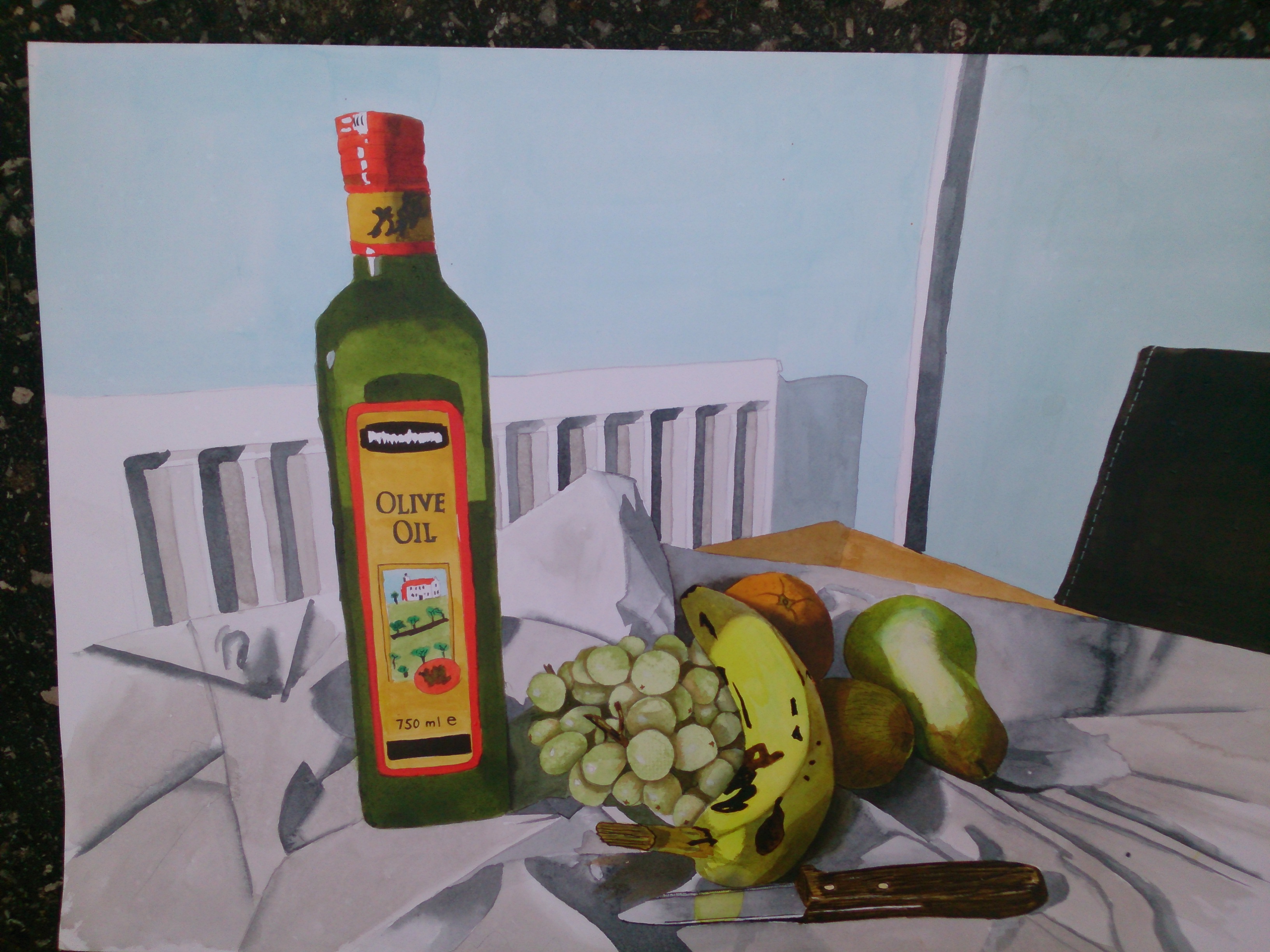
First drawing – still life study of natural forms
Second drawing – still life study of made objects

Paper edges of work submitted

Assignment 1
For my final drawings, I chose the following tools:
HB mechanic pencil – for guidelines
Dip pen – for lines and writing/detail
Sepia and black fine liner pens – for lines and texture work, eg: hairs on the kiwi fruit and wood grain texture on the knife.
Acrylic ink and brush- for large areas, local colour and shading. Transparent effect of glass bottle and shadows.
Ruler- for grid texture on radio
Sharpie felt tip pen- large text.
I have tried to link both of my drawings, via the sub theme “the senses: taste, smell, touch in my first drawing and sight, sound in my second drawing”
Drawing 1
As I am a vegan, I had to choose the ubiquitous fruit, however I included a half bottle of olive oil and tried to capture the beautiful transparent coloured nature of the glass with reflections and shadows. I thought acrylic ink was the perfect medium to depict this. I tried to capture the hairy texture of the kiwi fruit with fine liner pen as well as the texture of the wooden handle of the knife. I found the negative shapes and shadows between the grapes really helpful in trying to depict the forms. I included a section of a chair a radiator and door frame to add interest to the background. This was the exact placement of items in my very small kitchen where I to do my artwork. I find depicting crumpled or folded fabric really difficult, (regardless of medium) and obviously need a lot more practice. I have looked at the great masters as well as videos on you tube, and I can see the difference between hard edges and soft edges in the folds and understand the the science, but find the practice a very different matter.
Drawing 2
Again, ink was my obvious choice of medium here to reflect the nature and texture of the newspaper. I used the reverse smooth side of 300gsm watercolour paper as I thought depicting reflections on rough paper would not have worked. I have chosen very simple objects that most of see first thing in the morning, but I have never really looked closely at the until now. I enjoyed this still life very much.
Since starting this journey my opinion and attitude towards drawing and still life has changed totally. In the past I have regarded drawing as something that goes under paint, and that still life was something to be done in order to improve ones skills and techniques. But now I see how contemporary artist use still life as a form of expression, an art genre in its own right. Many artists have used vanitas to express the fleeting nature of life and the certainty of death.
Nowadays, still life has expanded so much and some mixed media still-life work uses found objects, photography, video, and sound, and even reaching from ceiling to floor, and filling an entire room in a gallery.
with the use of technology, still-life artists can even incorporate the viewer into their work.
I have purchased some of the recommended reading books for this course, and am totally inspired by them, especially “vitamin D – New Perspectives in drawing”. I draw every day now, and just by looking back on some sketches I can tell what sort of day it was and how I feeling at the time. Something a camera cannot do.
Reflection
Demonstration of Technical and Visual Skills – My knowledge of drawing materials is very limited at this early stage, as i have only just begun. My experience as a Jewellery designer and goldsmith is all i have. I am used to carving and sculpting in wax prior to casting in precious metals, and because of this i suppose i have a fairly good eye for proportion and measurements etc., for creating an accurate image. My sculpting work was in 3 dimensions so i know that i have a lot to learn to be able to create the illusion of a 3D image on a 2D surface. With the help of research (books, web and you tube) plus my transferable skills of visual awareness and design, these are my first attempts at drawing.
Quality of Outcome – given my very limited knowledge and Technical abilities, i have tried to apply them as best i can to convey my ideas and direction of thought. It is my goal to improve my skills to a high degree so that i may express myself further.
Demonstration of creativity – So far, this project has been experimental for me as i have never used these materials before. I have just lept in with both feet to see what i can do with them. I have no doubt that i will become more proficient with the tools and materials and that i will not be held back by a lack of skills to be more creative and expressive.
Context -Reflecting on what i have learnt from this project has taught me a lot, not only about drawing and art in general, but also about age and myself. I think age is just a number and therefore should not hold us back from learning new things, or expressing ourselves just as much as a younger person. Even more so i think. Since my enrolment, i have immersed myself totally, not only in drawing but the whole process of learning itself.

thank you for sharing your beautiful drawings. I am new to OCA, just enrolled my first course (drawing1) two days ago. I am a bit at lost right now not knowing how to start.